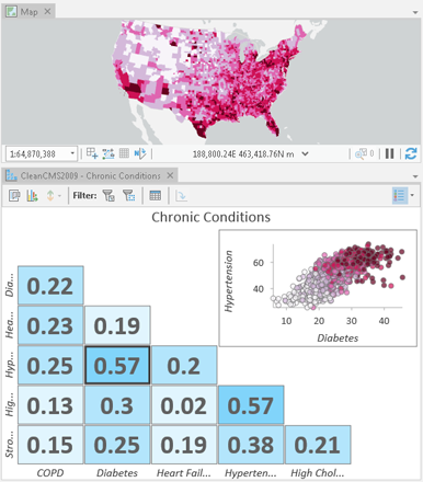
A scatter plot matrix is a grid (or matrix) of scatter plots used to visualize bivariate relationships between combinations of variables. Each scatter plot in the matrix visualizes the relationship between a pair of variables, allowing many relationships to be explored in one chart.
A scatter plot matrix is composed of a grid of mini-plots and one larger preview plot that shows a selected mini-plot in more detail. Additionally, a histogram showing the distribution of each numeric variable can be added to the matrix by checking Show histograms in the Chart Properties pane.
Variables
A scatter plot matrix is made up of three or more Numeric fields. A scatter plot will be created for every pairwise combination of variables.
Statistics
A regression equation is calculated for every scatter plot in the matrix. The associated trend lines can be added to the scatter plots by checking Show linear trend in the Chart Properties pane. Alternatively, the mini-plots in the grid can be viewed as R² values with a color gradient corresponding to the strength of the R² value by checking Show as R2 in the Chart Properties pane.
Appearance
Titles and description
Charts and axes are given default titles based on the variable names and chart type. These can be edited on the General tab in the Chart Properties pane. You can also provide a chart Description, which is a block of text that appears at the bottom of the chart window.
Visual formatting
You can configure the look of your chart by formatting text and symbol elements, or by applying a chart theme. Format properties can be configured on the Format tab in the Chart Properties pane, or through the Chart Format context ribbon. Chart formatting options include the following:
- Size, color, and style of the font used for axis titles, axis labels, description text, legend title, legend text, and guide labels
- Color, width, and line type for grid and axis lines
- Background color of the chart
Color
Scatter plot points can be visualized using a single color, or with the colors specified in the layer's symbology. By default, scatter plots use layer colors and inherit their outline and fill colors from the source layer symbology.
Example
Create a scatter plot to visualize the relationships between several chronic conditions and identify which correlations are strongest.
- Numeric variables—COPD, Diabetes, Heart Failure, Hypertension, High Cholesterol
- Show as R2—On
