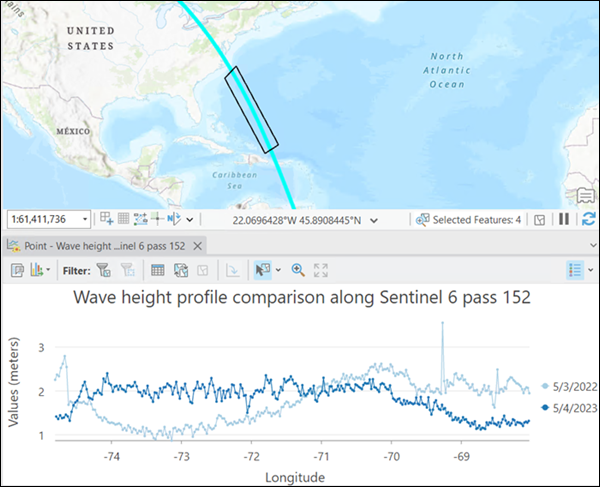
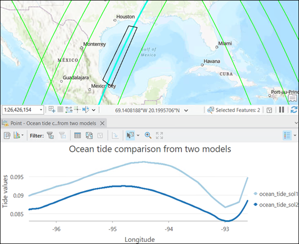
A trajectory profile chart allows you to visualize the variable changes of a trajectory layer. You can visualize and compare variables along one track or compare a variable between multiple tracks.
To create a trajectory profile chart, right-click a trajectory layer in the Contents pane, choose Create Chart, and click Trajectory Profile to open the chart properties.
The trajectory profile chart provides three data series to explore the data. In the chart properties, you can define the data settings, including data series, trajectories, variables, and properties to create a chart.
Data settings
Define the settings for a chart on the Data tab in the Chart Properties pane. These settings include data series, trajectories, a variable for the x-axis, one or multiple variables for the y-axis, sections of interest, and more.
Data series
Use the One variable with multiple tracks option to visualize changes for one variable with multiple tracks. You can compare the variable change along repeating tracks to understand the temporal change or compare a variable along tracks at various locations.

Use the Multiple variables with one track option to compare the variable changes along one trajectory. You can visualize the pattern of change for the different variables.

Use the One variable with multiple layers option to work with multiple layers. It is recommended that you create layers with the Make Trajectory Layer tool and with the same variable names. If the layer is a trajectory dataset that contains multiple trajectories, the selection or the first track is used for the layer.
Additional options
The following are additional options to define the trajectory profile chart:
- Variable for X-axis—Choose a dimension variable for the x-axis.
- Variables—Choose one or multiple variables that are required by the data series. The variables are used for the y-axis.
- Select trajectories—Select one or multiple trajectories that are required by the data series. You can select trajectories from the footprint sublayer using the map selection tools, and import the selections using the Get Selection tool in the chart properties, or use the Rectangle tool to select directly from the map.
- Define section of interest—Define the section of interest by drawing a polygon or selecting an existing polygon. When you create a trajectory chart, points are extracted from the trajectory files. Trajectory files may contain many points, especially for 20 Hz data. Using this option, you can avoid extracting unnecessary data.
- Data Labels—Specify whether data points are labeled in the chart.
- Statistics—View the statistics for each profile in the chart. The statistics are calculated from variables at the selected trajectory points.
Axes
Define the axes settings for a chart on the Axes tab in the Chart Properties pane.
X-axis
The surface profile x-axis displays the distance values along the profile. Default minimum and maximum x-axis bounds are based on the range of the polyline. The zero reference value corresponds to the first point drawn in the polyline. These values can be customized by providing a new x-axis bound value. Click the reset button to return the x-axis bound to the default value.
You can use the Unit parameter to convert between linear units.
Y-axis
The default minimum and maximum y-axis bounds are based on the range of data values represented on the axis. These values can be customized by providing a new y-axis bound value. Click the reset button to return the y-axis bound to the default value.
By default, line chart axes are displayed on a linear scale. To display numeric (nondate) axes on a logarithmic scale, check the Log axis check box.
You can format the way an axis displays numeric values by specifying a number format category or defining a custom format string. For example, $#,### can be used as a custom format string to display currency values.
You can use the Unit Scalar text box to define a custom value for converting or scaling the y-axis. For example, use 0.001 to convert y-axis values from meters to kilometers.
Add a guide
Guide lines or ranges can be added to charts as a reference or way to highlight significant y-axis values. To add a new guide, browse to the Guides tab in the Chart Properties pane, choose whether to draw a vertical or horizontal guide, and click Add guide. To draw a line, provide a value where you want the line to draw. To create a range, provide a to value. You can add text to a guide by specifying a Label value.
Create a trajectory profile chart
To create a trajectory profile chart to visualize the sea surface height using multiple repeating trajectory files, complete the following steps:
- Create a trajectory dataset from the trajectory files, and add it to the map.
See Work with trajectory data for details about creating a trajectory dataset.
- Right-click the trajectory dataset, and click Create Chart > Trajectory Profile.
- Click Set Data Series, and choose the One variable with multiple tracks option.
- Select the trajectory dataset variable to chart.
- To select trajectories, use the Rectangle tool to drag a small rectangle on the footprint of the desired tracks.
- Use the Polygon tool to define the section of interest.
- Click Create chart.
The trajectory profile chart is created and displayed on the chart tab on the map.
- Modify the title and labels for the x-axis and y-axis as necessary.