ArcGIS Pro uses a high-performance drawing engine to ensure maps and scenes draw quickly with smooth symbols and text.
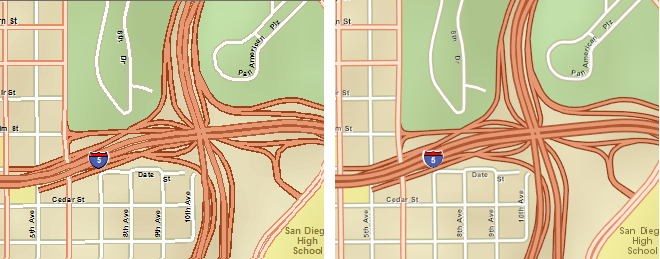
Because this drawing engine is different from the drawing engine used in ArcMap, you should be aware of some important differences in the appearance of a map drawn in ArcGIS Pro when imported.
The following sections describe some of these differences in drawing and why they occur.
Text and character marker antialiasing
In ArcMap, text and character marker antialiasing is controlled by the font smoothing settings configured in the machine's display settings. These settings are set per user and are not configured as part of the application.
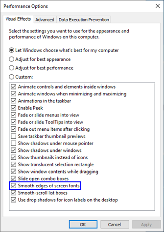
In ArcGIS Pro, these settings are configured within the application's options.
Because the ArcGIS Pro drawing engine uses a different method of enabling text and character antialiasing, and the algorithms used to execute this antialiasing are different, the text rendering and character markers may exhibit some differences when compared with the ArcMap display.

Coordinate rounding differences
In ArcMap, elements of the on-screen display are specified with integer coordinates. If the real coordinate of a feature (for instance, a line or a marker) does not lie exactly on that integer coordinate, it rounds up or down. This can result in some inaccuracies, particularly in the case of very thin lines or lines with very thin elements, such as cased lines. Lines whose sizes are less than one pixel at a given zoom level or display extent round up to one pixel.

In ArcGIS Pro, the drawing engine can use subpixel coordinates to place and draw features on the map. This results in greater accuracy of feature placement and symbology.

However, if the map's symbology was originally designed in ArcMap, the appearance may be different in ArcGIS Pro. This is especially evident in line symbology.
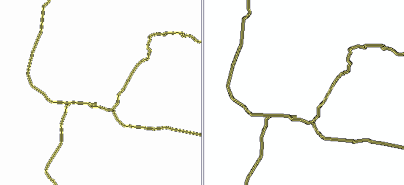
ArcGIS Pro is capable of applying antialiasing to alleviate the effects of the changed appearance, but there are some cases in which antialiasing is not the best option. For example, using antialiasing can reduce drawing performance. Depending on the requirements of the map, this may be unacceptable. Also, for target export formats that use an 8-bit palette (such as PNG 8 or GIF formats), antialiasing may not be as effective due to the dithering required to render continuous progressions of color.


To alleviate this situation, manually change the size of the multilayer line symbol so that the line sizes are more appropriate. This also allows conversion for use with a target dpi other than 96 dpi (for instance, a target resolution of 120 dpi).
Design lines for a specific resolution (dpi)
To determine the appropriate line sizes for a given resolution, input the sizes of each of the symbols in the multilayer line symbol into the following formula. As mentioned above, the value for TargetResolution should reflect the desired minimum resolution at which this symbol will be used. Note that the hard-coded number of 72 in the examples below is the conversion factor of points per inch.
WidthInPixels = (LineWidth in points * TargetResolution in dpi)/72
If WidthInPixels is less than 1.5, the width should not be changed.
If WidthInPixels is equal to or greater than 1.5, use the following formula to determine the edited width:
- NewWidthInPoints = (WidthInPixels + 0.5).
- Round NewWidthInPoints to the nearest integer (whole number) value that is not greater than NewWidthInPoints.
- Set the final line width to (RoundedNewWidthInPoints * 72)/TargetResolution.
For example, if your desired resolution is 44 dpi, and your line symbol's width is 2.60, the math would be executed as follows:
- WidthInPixels = (2.60 * 44)/72.0.
- WidthInPixels is 1.5888888, which is greater than 1.5, so continue.
- NewWidthInPoints = (1.588888 + 0.5) = 2.10.
- Rounding down, NewWidthInPoints = 2.0.
- The final line width should be set to (2.0 * 72)/44 = 3.27 points.
In another example, if your desired resolution is 120 dpi, and your new line symbol's width is 2.60, the math executes as follows:
- WidthInPixels = (2.60 * 120)/72.
- WidthInPixels is 4.33333, which is greater than 1.5, so continue.
- NewWidthInPoints = (4.33333 + 0.5) = 4.83.
- NewWidthInPoints is rounded down to the nearest integer, 4.0.
- The final line width should be set to (4.0 * 72)/120 = 2.4 points.
Simple symbols
Simple symbols (simple line symbol, simple fill symbol, and simple marker symbol) sometimes display in an inconsistent manner in ArcMap. Because of these inconsistencies, simple symbols may sometimes draw differently in ArcGIS Pro. You might be informed of some of these differences in the log file that is generated when you import a map.
For instance, simple line symbols using a dash or dash-dot pattern do not honor a map's reference scale and draw with different spacing depending on the dpi requested. In ArcGIS Pro, these symbols honor the map's reference scale and do not change with the requested dpi.
For simple fill symbols, the Style property is not available on the ArcMap user interface, but many developer samples and other third-party code snippets might create these symbols in a map. Styles other than esriSFSSolid are not supported in ArcGIS Pro and result in an error in the import log.
For simple marker symbols, the behavior of the simple markers changes depending on the size at which they display, causing some variations in their size and shape.
ArcGIS Pro always displays marker symbols at the requested size. In ArcMap, when a simple marker symbol's size is below a certain threshold, it will not draw any smaller. This means that when this threshold is reached, ArcGIS Pro continues to display these symbols at an accurate size, whereas ArcMap does not, resulting in an apparent mismatch.
Line decorations
For line symbols containing line decorations in ArcMap, such as line arrowheads, the decoration is not drawn when it is larger than the line length of the feature being decorated. The drawing engine used by ArcGIS Pro always draws line decorations regardless of the size of the line. At some scales, this can lead to a more cluttered appearance than in ArcMap, but line decorations are drawn consistently and predictably.
Color
The drawing engine used by ArcGIS Pro uses a color management engine. Because of this, some colors may not exactly match the appearance of the ArcMap display.
ArcMap does not use color management. In particular, you may notice differences in color when using the following:
- Colors defined in color spaces other than RGB (for instance, colors defined in HSV, CMYK, or grayscale)
- Algorithmic color ramps using HSV, CIELab, or LABLch algorithms
One thing that can be done to minimize the color differences in a map service is to change the monitor settings within ArcMap. This can be useful when authoring a map to import into ArcGIS Pro.
To access the monitor settings, on any Symbol Properties dialog box, click the drop-down menu on the color swatch and choose More Colors.
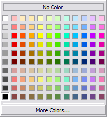
On the Color Selector dialog box, click the arrow button and choose Monitor Setup.
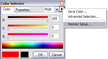
On the Monitor Setup dialog box, change the Gamma setting to 2.2 and click OK to close the dialog box.
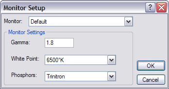
This instructs ArcMap to use a gamma value that more closely matches the color profile used by the drawing engine of ArcGIS Pro.
Note:
This setting only affects the appearance of maps drawn by the user and the computer on which this modification is performed.
Font handling
Fonts are handled slightly differently in ArcGIS Pro when compared with ArcMap. Specifically, text does not provide faux italic or faux bold styles as were rendered in ArcMap. You must use a font that has italic or bold styles in order to specify italic or bold. Faux italic and faux bold refer to situations where a font is not available in the bold or italic styles, or the combination of properties does not have a corresponding font installed. For instance, you might have Verdana Bold and Verdana Italic but be missing Verdana Bold Italic.
In the faux italic and faux bold styles, the original font is graphically skewed (italic) or thickened (bold).

This does not often correspond visually to the actual bold or italic version of the typeface. Indeed, for some fonts (such as the Esri fonts designed for use as marker symbols), it does not make sense to display them in bold or italic styles. ArcGIS Pro displays with only those fonts and font styles that are available on the system.

Font linking and font fallback
Fonts contain definitions for specific characters (the Latin letter A, Chinese glyph  [qian], and so forth) in different character sets (such as Western Europe or Cyrillic) as determined by their creators. Font fallback and font linking are methods of displaying characters that do not actually exist in the requested font by drawing them in another similar font that does contain them. These methods are commonly used to display Latin characters with a font that only contains East Asian characters, or vice versa.
In cases like these, the ArcMap display uses Windows GDI (graphics device interface, a graphics system built into Windows) to attempt to link to another font that contains the missing glyphs so the text string can display despite the missing characters. ArcGIS Pro uses similar logic so that the string can still be rendered. Unlike ArcMap, ArcGIS Pro fallback will render properly in output formats that reference fonts, such as PDF or EPS. Keep in mind that in many cases, relying on fallback will still result in less-than-optimal appearance due to mismatches in kerning or other characteristics between the original font and the linked fallback font (see the image below).

Because of these issues, relying on font fallback to render the proper glyphs is not a recommended practice for any map.
In general, the best practice is to use a font that contains glyphs for the character set you are attempting to use. In the example above, the selected font Arial Unicode MS is missing the Thaana character set. To ensure that the text renders correctly, use inline text formatting tags to switch to a font containing Thaana characters, such as MV Boli.
Font substitution
A similar technology, font substitution, is a method of displaying text in a different font when the requested font is not present on the system. For instance, if a map contains text that uses the font Helvetica but Helvetica is not installed on the machine, the text appears in Arial instead.
ArcGIS Pro can use font substitution just like ArcMap can. However, in general, it is a good practice to ensure that the fonts used in the map are available on the machine that will use the map.