You can interact with a chart to explore your data and get more information.
Selection
Selection is dynamic between charts, maps, and attribute tables. Selecting one or more features in your chart will select the same features in your map and table. Similarly, a selection in your map or table will also be reflected in your chart. To make a selection in your chart, do the following:
- Ensure your chart is in select mode by clicking the Select Mode button
 in the chart window.
 - Use one of three selection tools in the selection drop-down menu to make a selection in your chart.
- Rectangle
 —Click a chart element, or click and drag the rectangle across the chart.
 - Polygon
 —Click in the chart to create the vertices of the polygon. Double-click to close the polygon and complete the selection.
 - Lasso
 —Press and hold the left mouse button and draw with the pointer to create a freehand shape in the chart.
- Rectangle
- To
clear the selection, click a
blank area of the chart, or click the Clear selection button
 in the chart window.

Interactive selection allows you to explore features of interest and can also be used as a filtering mechanism. For example, you might use selection to highlight features of interest and run a geoprocessing tool on the selection set. You could also export the selected features as a new layer or table.
Learn more about selecting features in a map
Note:
When data comes from an enterprise database or cloud data warehouse source, selection is not available for bar charts, line charts, histograms, and scatter plots.
Zoom
Zoom can be used to examine part of a chart in more detail. To zoom in to an area in your chart, do the following:
- Ensure your chart is in zoom mode by clicking the Zoom Mode button
 in the chart window.
 - Click and drag to create a rectangle around the area of interest.

- To pan, click and drag the mouse wheel button.
- To return to the chart's full extent, click the Full Extent button
 in the chart window.
The following mouse and keyboard shortcuts are available to facilitate chart exploration:
| Mode | Shortcut | Function |
|---|---|---|
Select mode | Left button drag | Selection rectangle |
Right button drag | Zoom rectangle | |
Zoom mode | Left button drag | Zoom rectangle |
Right button drag | Selection rectangle | |
Wheel button scroll | Zoom in and out | |
Any mode | Left button drag + Shift | Zoom rectangle |
Wheel button drag | Pan | |
Left button drag + C | Pan | |
Insert | Full extent |
Filter
Charts, like maps and tables, do not display features out of the current range or query applied to the source layer. You can visually filter charts using the range slider, time slider, definition queries, or any combination of the three.
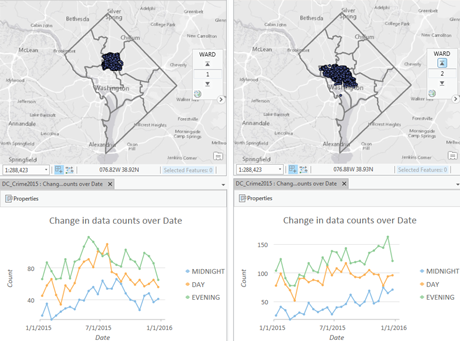
In the following example, a range slider was used to filter crimes in Washington, D.C., based on ward number. As the ward number changes, the map and chart update to show only crimes that took place in the specified ward.

- Learn more about using the range slider
- Learn more about using the time slider
- Learn more applying definition queries
Data on a chart can also be filtered according to a map's extent and selection set.
When Filter by Extent is enabled, the chart only draws based on features in the current visible geographic extent of the active map or map frame. As you pan and zoom in the active map to different spatial extents, the chart redraws to reflect the new extent.
Note:
Filter by Extent is only available in 2D map views.
When Filter by Selection is enabled, the chart only draws features that are currently selected. The selection can be made in the map, the attribute table, or another chart created from the same layer.
Filter by Selection can be used as a way to zoom in to a chart. To do this, create two identical charts and set one of them to filter by selection. Then, when you make a selection in the unfiltered chart, the filtered chart will zoom to only that area that has been selected. 
ToolTips
Hover over any data object in your chart to reveal more detailed information in a ToolTip. ToolTips display the variables and values for the associated record or records. This allows you to quickly interrogate the chart for exact values.
Legend
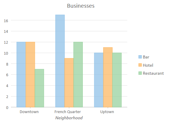
Some charts include a legend to distinguish between series or to display statistical information. You can click an item in the legend to turn it on and off in the chart.
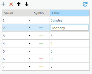
Legend items for bar and line charts can be reordered, relabeled, and deleted on the Series tab in the Chart Properties pane.
Legend visibility or placement can be changed using the Legend button  in the chart window.