Available with 3D Analyst license.
Profile graphs allow you to visualize elevation (Z) or measure (M) change over a continuous horizontal distance using 3D line geometry. Visualizing this change with a profile graph allows the change to be displayed simultaneously for multiple 3D line features. You can make a profile graph for any 3D line layer in the Contents pane.
Note:
- A profile graph can be viewed without an ArcGIS 3D Analyst extension license, but the creation of a profile graph requires an ArcGIS 3D Analyst extension license.
- A profile graph supports a maximum of 1000 lines. If there are more than 1000 line features in the layer, select at least 1 and at most 1000 of them. Only the selected features will be graphed. If there are 1000 or fewer features, you can optionally select 1 or more to be graphed.
- Features that are not visible due to a definition query or other filters are not counted in the above-mentioned numbers and are not graphed.
- Once you create a profile graph, you cannot add or remove lines from that particular graph. You can change the lines that are displayed in the chart window using the graph selection or extent filter, and you can switch an individual line between visible and hidden by clicking its corresponding graphic in the graph's legend. However, the lines in the graph will always be a subset of the original lines used to build the graph. To graph a different set of lines, create a new profile graph.
A profile graph can be used to display the result of the Line Of Sight geoprocessing tool; visible and invisible portions of the output lines will be arranged to make a continuous graph. If, before running the tool, you output graphing attributes (additional point data) with the output lines, the profile graph can display observer, target, and obstruction points as well as connecting lines (from observer to target). The default is to output this information from the Line Of Sight geoprocessing tool.
In addition, a profile graph can chain together (display end to end) separate line features that meet at their end vertices. If, for example, you have a road or stream the centerline of which has been split into separate features, the separate features can be displayed end to end.
The color and thickness of lines in the graph will match the color and thickness of the lines in the map or scene.
All of the factors that go into creating the chart are saved with the project. When you save the project, close it, and open it again, the contents of the chart remain the same.
Chart Properties pane
The Chart Properties pane consists of multiple tabs; the two tabs specific to profile graphs are the Data and Axes tabs. To access the Chart Properties pane, click the Properties button in the upper corner of the chart window.
Data tab
The Data tab includes the sections described below.
General
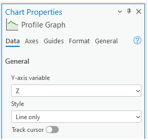
The General section consists of a drop-down list of choices of what can be displayed in the y-axis of the chart, a drop-down list of choices for display style, and a toggle switch to enable or disable tracking of the cursor.

You can select Z or M from the Y-axis variable drop-down menu. Each vertex of a 3D line (Polyline Z) has a z-value (elevation) and, optionally, an m-value (measure). M-values, for example, can be used to represent toxicity or oxygen levels along a route or river.
You can select an option from the Style drop-down menu: Line only, Line and vertices, or Fill.
The following is an example of the Line only option:

The following is an example of the Line and vertices option:

The following is an example of the Fill option:

Checking the Track cursor check box displays a point overlay (a small white circle) in the map or scene to indicate the position of the cursor in the chart. This point overlay moves in the map or scene as the cursor is moved in the chart. In the chart, a vertical line marker moves along with the cursor, and a label indicates the horizontal distance from the beginning of the line. If there is more than one line displayed in the chart, one point overlay will appear for each line in the chart. However, if a line is selected in the chart, the tracking will occur only along that line. If the cursor moves out of range of the line in the chart, the point overlay will disappear. When the cursor moves off of the chart, or this option is turned off on the Chart Properties Data tab, all of the point overlays will disappear.
Line Of Sight Output
The Line Of Sight Output section relates to graphing output from the Line Of Sight tool; it only appears if the output includes the SourceOID, VisCode, and TarIsVis fields. These fields are automatically added to the output of the Line Of Sight tool.
This section includes Points and Connecting line check boxes. Both depend on the output having the additional OBSERVERZ, TARGETZ, and OBSTR_DIST fields (referred to in the Line Of Sight tool as graphing attributes). For each sight line used as input to the Line Of Sight tool, there is typically one visible line of sight and one invisible line of sight. If no multipatch features were input to the tool, the output lines of sight represent a profile of the surface. If multipatch features were input, the lines of sight run along an imaginary straight 3D line from the observer to the target.

- Points—Check this option to display observer, target, and obstruction points. The observer and target points take into consideration any vertical offsets that were applied when the Line Of Sight tool was run. The obstruction point, if any, lies along an imaginary straight 3D line connecting the observer point to the target point.
- Connecting line—Check this option if you want a line connecting the observer point to the target point drawn for each source sight line.
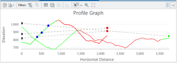
The following example of three pairs of visible and invisible lines results from the Line Of Sight tool output, with points and connecting lines displayed. In this case, two of the pairs are identical, so the lines give the impression of there being only two pairs.

Chaining
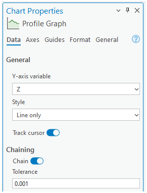
The Chaining section deals with chaining lines in the chart, meaning that they are displayed end to end, rather than each one starting from zero on the x-axis. Lines are connected if their end vertices are located at the same x,y-location. Lines are only connected going from the end vertex of one line to the start vertex of the next line. This uses the Tolerance value. If more than two lines meet at a juncture, the chaining goes with the first one found. This section only appears when there is more than one line and the lines don’t contain SourceOID, VisCode, and TarIsVis fields. These fields are the output from the Line Of Sight tool.
The Tolerance option value is the maximum 2D distance from the end vertex of one line to the beginning vertex of another line to chain them together in the graph. The default is 0.001.

Lines that are not chained are displayed the same as usual, in the same graph with the chained lines. There can be multiple chains in the graph. Multipart lines should appear with gaps if there are gaps between parts. Cursor tracking should behave logically in multipart lines with gaps and in chains. Selection plays no role in chaining.
The following profile graph shows individual lines (before the Chain option is turned on):

The following profile graph shows a chained line (after the Chain option is turned on):

Axes tab
Profile graphs consist of continuous horizontal distance on the x-axis and either elevation (Z) or measure (M) on the y-axis. The horizontal distance refers to the distance from the beginning of each 3D line when projected onto an imaginary horizontal plane, measured along the line. This applies whether or not all vertices are collinear in this horizontal projection. The automatic adjustment of visible and invisible lines that are output from the Line Of Sight tool, or the optional chaining of lines that are not from that output, will cause some or most lines to not appear to begin at zero on the x-axis.

The units of measure for the horizontal and vertical axes are displayed in drop-down menus on the Axes tab in the Chart Properties pane. When a profile graph is created, its unit of measure is set to that of the dataset. If no unit of measure is assigned, the unit of measure will be meters (the default value). After a profile graph is created, you can select other units from the drop-down menus, and the profile graph and the axes will be redrawn accordingly.
Invert axis
The Invert axis option only impacts the x-axis (horizontal axis). When checked, the graph will be drawn from right to left rather than from left to right.
Vertical exaggeration
When a profile graph is created, it fills the chart window. When you resize the window, the profile graph is redrawn, which typically alters the apparent vertical exaggeration. You can edit the minimum and maximum bounds for either of, or both, the x-axis and y-axis. This also typically alters the apparent vertical exaggeration.
You can effect a vertical exaggeration by providing a value for the Vertical exaggeration option. To remove the value, click the Reset button next to the text box.
A value of 1 means that the vertical scale will be the same as the horizontal scale. Larger values exaggerate the vertical scale, for example, the graph will be taller or inflated in the vertical direction, and smaller values will shrink the vertical scale. Leaving this option blank, by clicking the Reset button, enables the charting system to automatically fit the y-axis values, and the y-axis scale will depend on the window shape and the values specified for axes minima and maxima, if any.
If a value is specified for this option, the graph will be centered vertically.
Appearance
You can edit default properties of a profile graph and change its appearance in several ways.
Titles and description
The default profile graph title is based on the name of the feature layer being graphed. The title and axis labels can be edited on the General tab in the Chart Properties pane. You can also provide a Description value, which is text that appears at the bottom of the chart window.
Extent and clipping
If you turn on the Extent filter, each of the lines that appear at least partially in the visible portion of the map also appear in the chart window. The features will be clipped by the extent of the visible portion in the map. This is only available in a map view, not a scene view. This functionality is also supported in layouts.
Color
The color of each line in a profile graph will be the same as the color of the line in the map display. If the current renderer is Single Symbol, all lines will be the same color. To use different colors for different lines, change the renderer to Unique Value.
Legend
The legend displays one small graphic for each line in a profile graph using the same color as the line; the nature of the graphic in the legend is dependent on the display style specified on the Data tab. Next to each graphic is a number, which is the ObjectID, FeatureID, or OID value of the point. By default, the legend is not displayed when a new profile graph is created. A legend is not displayed when there is one line in a profile graph.
Selection
You can select a line by clicking any of the following:
- The line in the map display
- The row in the line layer's attribute table
- The line in the profile graph
- The legend item in the profile graph
Note:
The first click on the legend item causes the line to disappear from the profile graph, and a second click on the same legend item causes the line to reappear. If you select multiple lines in the map or attribute table, only one line will appear selected in the profile graph.
Export As Table
A table consisting of three columns and multiple rows will be exported. The table will consist of the following fields:
- id—The object ID of the line
- x—The horizontal distance along the line
- y—Either the z (elevation) at the vertex or the m (measure) value at the vertex
Tooltips
When you hover over a line in a chart, a tooltip presents information about the line. The y-axis value is displayed for the vertex that immediately precedes that section of the line. If you hover over an obstruction point, that point's information appears in the tooltip.
Example
The example below shows a profile graph that displays elevation change over the length of the input 3D lines.
- X-axis—Horizontal distance
- Y-axis—Elevation
Note:
The legend can be shown or hidden using the toggle button in the upper corner of the chart window.
