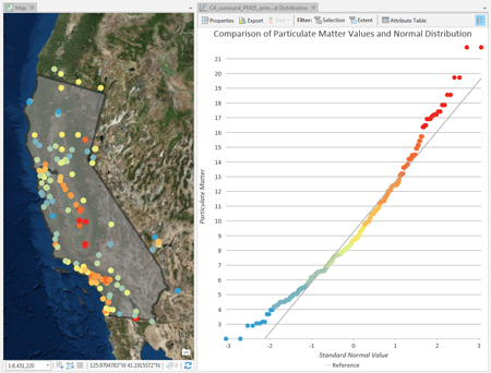
Quantile-quantile (QQ) plots are an exploratory tool used to assess the similarity between the distribution of one numeric variable and a normal distribution, or between the distributions of two numeric variables.
There are two types of QQ plots, normal QQ plots and general QQ plots.
- Normal QQ plots are constructed by plotting the quantiles of a numeric variable against the quantiles of a normal distribution.
- General QQ plots plot the quantiles of one numeric variable against the quantiles of a second numeric variable.
If the distributions of the compared quantiles are identical, the plotted points will form a straight 45-degree line. The farther the plotted points deviate from a straight line, the less similar the compared distributions.
Variables
Normal QQ plots require one numeric variable that will be plotted against a normal distribution. General QQ plots require two numeric variables that will be plotted against each other.
Transformation
Some analytical methods require that data be normally distributed. When the data is skewed (the distribution is lopsided), you might want to transform the data to make it normal. Normal QQ plots allow you to explore the effects of logarithmic and square root transformations on the distribution of your data while comparing them to a normal distribution.
Logarithmic transformation
The logarithmic transformation is often used where the data has a positively skewed distribution and there are a few very large values. If these large values are located in your dataset, the log transformation will help make the variances more constant and normalize your data.
Note:
Logarithmic transformations can only be applied if all of the variable's values are greater than zero. Any values of zero will result in an error.
Square root transformation
A square root transformation is similar to a logarithmic transformation in that it reduces right skewness of a dataset. Unlike logarithmic transformations, square root transformations can be applied to zero.
Note:
Square root transformations can only be applied if all the variable's values are greater than or equal to zero. Any negative values will result in an error.
Inverse
An inverse transformation takes the reciprocal (1/x) of each value (x) in the field.
Note:
Inverse transformations cannot be applied to zero values. If there are zero values in the field, they are treated as null.
Box-Cox
A Box-Cox transformation applies the following power function to normally distribute values:

Note:
Box-Cox transformations can only be applied to positive values. In cases where negative or zero values exist, use the Shift parameter to ensure all values are positive.
Axes
Several options control the axes and related settings.
Axis bounds
Default minimum and maximum axis bounds are set based on the range of data values represented on the axis. These values can be customized by typing a new desired axis bound value. Clicking the reset icon will revert the axis bound to the default value.
Grid intervals
Configure grid intervals for the x-axis and y-axis using the Interval controls. The default grid intervals will be calculated automatically.
Number format
You can format the way an axis will display numeric values by specifying a number format category or by defining a custom format string.
Appearance
Titles and description
The charts and axes default titles are based on the variable names and chart type. These can be edited on the General tab in the Chart Properties pane. You can also provide a value for the Description option, which is a block of text that appears at the bottom of the chart window.
Color
QQ plots inherit their outline and fill colors from the source layer symbology. By symbolizing a layer with a different attribute than either of the QQ plot variables, a third variable can be shown on the QQ plot visualization.
Guides
Guide lines or ranges can be added to charts as a reference or to highlight significant values. To add a new guide, on the Guides tab in the Chart Properties pane, click Add guide. To draw a line, provide a value for Value where you want the line to draw. To create a range, provide a to value. You can also add text to a guide by specifying a Label value.
Example
Create a QQ plot to evaluate whether particulate matter samples in California are normally distributed.
- Compare the distribution of—Particulate Matter
- With transformation—None
- To—<Normal Distribution>
