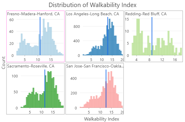
Histograms visually summarize the distribution of one or more continuous numeric variables by measuring the frequency at which certain values appear in the dataset. The x-axis in a histogram is a number line that has been split into number ranges, or bins. For each bin, a bar is drawn in which the width of the bar represents the range of the bin, and the height of the bar represents the number of data points that fall into that range. Understanding the distribution of data is an important step in the data exploration process.
Variable
Histograms require one or more continuous Number variables on the x-axis.
Multiple series
The following video demonstrates how to create multiple series histograms using the Split by field:
- Video length: 0:57
- This video was created with ArcGIS Pro 3.2.
You can create multiple series histograms in one of two ways. Selecting multiple Number variables will create a new histogram series for each field and transformation selected. For example, you may add the same variable multiple times to compare the effect different transformations have on the distribution.

Alternatively, when a single Number variable is set, you can use the Split by drop-down menu to split the histogram into multiple series based on the number of unique categories in the field. For example, when displaying a histogram for a dataset related to housing prices, the Number control is set to SoldPrice to see the distribution of housing prices in a city. Setting the Split by control to Neighborhood splits the histogram into N series in which N is the number of unique neighborhood values. The multiple series histogram displays N mini charts, one for each unique Neighborhood value, so that the housing price distribution can be compared across the Split by values.
Note:
Category fields with many unique values are not appropriate for splitting a field into multiple series.
Multiple series histograms can only be displayed with a grid layout. The statistics displayed on the Data tab of the Chart Properties pane correspond to the summarized values for the selected mini chart. You can customize the dimensions of a grid chart layout by setting the Mini charts per row value on the Series tab of the Chart Properties pane. For example, setting Mini charts per row to 3 displays a maximum of three charts per row—the total number of rows in the grid is determined by the number of series in the chart. Check the Show preview chart check box to dynamically explore each mini chart in detail by choosing one to view in the larger preview chart.

Transformation
Some analytical methods require that data be normally distributed. When the data is skewed (the distribution is lopsided), you may want to transform the data to make it normal. Histograms allow you to explore the effects of data transformations on the distribution of data. For reference, you can add a normal distribution overlay to a histogram by checking the Show Normal distribution check box in the Chart properties pane.
Logarithmic transformation
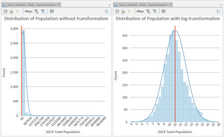
The logarithmic transformation is often used when the data has a positively skewed distribution and there are a few large values. If these large values are located in the dataset, the log transformation will help make the variances more constant and normalize the data.
For example, the positively skewed distribution in the first chart below is transformed to a normal distribution using a logarithmic transformation in the second chart:

Note:
Logarithmic transformations can only be applied to numbers greater than zero.
Square root transformation
A square root transformation is similar to a logarithmic transformation in that it reduces right skewness of a dataset. Unlike logarithmic transformations, square root transformations can be applied to zero.
Note:
Square root transformations can only be applied to numbers greater than or equal to zero.
Inverse transformation
An inverse transformation takes the reciprocal (1/x) of each value (x) in the field.
Note:
Inverse transformations cannot be applied to zero values. If there are zero values in the field, they are evaluated as null values.
Box-Cox transformation
A Box-Cox transformation applies the following power function to normally distribute values:

where x' is the transformed value, x is the original value, λ1 is the Power parameter value, and λ2 is the Shift parameter value.
Note:
Box-Cox transformations can only be applied to positive values. When negative or zero values exist, use the Shift parameter to ensure that all values are positive.
Number of bins
The number of bins default value is the square root of the number of records in the dataset. You can adjust this by changing the Bins value on the Data tab of the Chart Properties pane. Changing the number of bins allows you to see more or less detail in the structure of the data.
Note:
Histograms are limited to a maximum of 64 bins. This limit is imposed because using too many bins often results in a noisy histogram in which the characteristics of the distribution are difficult to interpret.
Statistics
Several descriptive statistics are calculated and displayed as vertical lines on histograms. The mean and median are displayed with one line each, and one standard deviation above and below the mean is displayed using two lines. You can click these items in the chart legend to turn them on or off.
A statistics table is displayed on the Data tab of the Chart Properties pane, containing the following statistics for the selected numeric field:
- Mean
- Median
- Standard Deviation
- Count
- Min
- Max
- Sum
- Nulls
- Skewness
- Kurtosis
If the chart's source layer has a selection set, the statistics table will have one column displaying statistics for the full dataset and one column displaying statistics for only the selection set.
The statistics table also includes controls to turn the histogram's mean, median, and standard deviation lines on and off, and change their color.
To copy statistics from the Charts Properties pane into other windows or applications, right-click in the statistics table, and choose Copy Table, Copy Row, or Copy Value.
Axes
The options described below control the axes and related settings.
Axis bounds
Default bounds for axes are based on the range of data values represented on the axis. You can customize these values by providing a new axis bound value. You can set axis bounds to keep the scale of the chart consistent for comparison. Click the Reset button  to revert the axis bound to the default value.
Adaptive axis bounds
The axis bounds for multiseries histograms can be configured with the following options:
- Fixed—Applies the global minimum and maximum bounds to each minichart.
- Adaptive—Adjusts to the local minimum and maximum bounds for each minichart.
Grid intervals
Configure grid intervals for the y-axis using the Interval control. The default grid interval is calculated automatically.
Number format
You can format the way an axis displays numeric values by specifying a number format category or defining a custom format string. For example, you can use $#,### as a custom format string to display currency values.
Appearance
The options described below control the appearance of a histogram.
Titles and description
The charts and axes default titles are based on the variable names and chart type. These can be edited on the General tab in the Chart Properties pane. You can also provide a value for the Description option, which is a block of text that appears at the bottom of the chart window.
Series style
Series style can be configured on the Series tab in the Chart Properties pane by clicking the Symbol color patch in the Series table. Use the pop-up to configure the color and transparency for bins. To apply a common style to multiple series, select multiple rows in the Series table, and click the Symbol color patch for one of the selected series. Alternatively, use the Color scheme drop-down list on the Series tab to apply a palette to the series in a chart.
Data labels
Labels displaying the value of each bin can be turned on by checking Label bins on the Data tab in the Chart Properties pane. Additional series-level style options can be configured on the Series tab by clicking the text patch in the Data Labels column of the Series table.
Guides
Guide lines or ranges can be added to charts as a reference or way to highlight significant values. To add a new guide, go to the Guides tab in the Chart Properties pane, and choose whether you want to draw a vertical or horizontal guide. Click the arrow on the Add guide button, and select one of the following options:
- Create fixed value line or range guide—Draw a line or range guide at a fixed location. When this option is selected, provide a value for Value where you want the line to draw. To create a range, provide a to value.
- Create data-driven guide—Draw a data-driven guide. When this option is selected, use the Value drop-down list to select a field whose values will be used to calculate the location of the guide. Select an aggregation option to specify how these values are summarized.
- Create point or polyline guide—Draw a point or polyline guide. When this option is selected, edit the data table to input x- and y-values that will create the vertices to determine how the guide line is drawn. Enter one vertex to create a point guide. This option is only available when both axes are continuous.
Example
The histogram below visualizes distribution of population density across Washington, D.C., census block groups using the following setting:
- Number—Population Density

