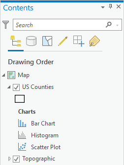
You can make a chart from any map layer that has an attribute table, including stand-alone tables. To create a chart from data that is not yet in the map, add the layer to the map so it appears in the Contents pane.
Create a chart
You can create a chart from the Contents pane, the Data contextual tab, or an attribute table.
Start a new chart
To create a chart, complete the following steps:
- Select the layer or stand-alone table in the Contents pane.
- On the layer's contextual Data tab, click Visualize > Create Chart.
Alternatively, right-click the layer in the Contents pane, and click Create Chart.
- Choose the type of chart to make from the menu.
- A chart window appears. This remains blank until you define the chart's variables.
- The Chart Properties pane appears where you can define the chart variables, properties, and title text.
- A new chart is added to the Charts section under the source layer in the Contents pane on the List By Drawing Order tab
 .
.
After you choose the type of chart to make, the following occur:
Visualize field statistics
You can also create a chart while viewing the attribute table of a layer or stand-alone table by right-clicking a field name and choosing the Visualize Statistics option. This automatically determines the best chart type for visualizing the selected field and opens the new chart fully configured.
Chart window
Charts are displayed in a dockable window or view. Chart windows can be moved or docked similarly to how you work with maps, layouts, and attribute tables. When you use one of the options, no data or value labels are displayed in the chart window. To display data on the chart, you must define chart variables.
Define chart variables
To display data on the chart, complete the following steps to define required chart variables by selecting attribute fields from the source layer:
- On the Data tab of the Chart Properties pane, select the attribute fields required to create the chart.
- Depending on the type of chart you are making, adjust other properties, such as Numeric fields, Aggregation, or Transformation as necessary.
- On the General tab of the Chart Properties pane, edit the chart and axes titles, and provide a description.
After you define the chart variables, the chart window displays the values on the axes, and data is drawn on the chart.
Configure the appearance of the chart
Charts automatically match their layer's colors when possible. This includes unaggregated charts (such as scatterplots), or charts aggregated using the same attribute being used to symbolize the layer (such as bar charts). Chart series and symbol colors can be customized in the Chart Properties pane by clicking the Symbol color swatch in the Series table and manually choosing a color.
You can configure the look of a chart by formatting text and symbol elements, or by applying a chart theme. Format properties can be configured on the Format tab in the Chart Properties pane. A chart theme can be selected on the Chart tab. Chart formatting options include the following:
- Size, color, and style of the font used for axis titles, axis labels, description text, legend title, legend text, and guide labels
- Color, width, and line type for grid and axis lines
- Background color of the chart