The first step in making a map is defining the map's purpose. The second step is acquiring and preparing data to support the purpose. The third step is authoring the map. Authoring a map involves making cartographic decisions about how to present data so the map achieves its purpose. In a dynamic environment, where map users can zoom and pan, the map should be designed to work at a variety of scales.
Overview
- This video was created with ArcGIS Pro 3.1.
In this tutorial, the purpose of your map is to show the accessibility of medical facilities in Scotland. You'll open a project that contains a starting map with the data you need. You'll work with map and layer properties, symbolize and label layers, filter data with definition queries, and set visibility ranges on layers. You'll view the final map at different scales and test its accessibility for people with color vision deficiencies.
- Estimated time: 60 minutes
- Software requirement: ArcGIS Pro Basic
Note:
The quick-start tutorials are updated at each software release. For the best experience, use an online help version that matches your software version.
Open the project
The data in your starting map includes medical facility locations, roads, population centers, and rural areas.
- Start ArcGIS Pro and sign in if necessary.
- Open a browse dialog box to search for the project in one of the following ways:
- On the start page, click Open another project
 .
. - In an open project, click the Project tab on the ribbon. In the list of side tabs, click Open. On the Open page, click Open another project
 .
.

- On the start page, click Open another project
- On the Open Project browse dialog box, in the navigation pane, under Portal
 , click ArcGIS Online
  .
.Note:
If you are signed in to ArcGIS Enterprise
 , you must set your active portal to ArcGIS Online to access the tutorial data. If you can't do this, you can download the data from a browser.
 - At the top of the dialog box, in the Search box, type Author a map v310 and press the Enter key.
- In the list of search results, click Author a map v310 to select the project package.
Note:
If there is more than one project package with this name, select the package with the Authoritative badge
 . In the Owner column, the owner name is ArcGISProTutorials. If you don't get any results, see No search results are returned.
 - Click OK.
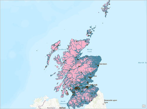
A map of Scotland opens showing medical facilities, roads, and cities. The map is hard to interpret. The symbol colors are arbitrary, the roads are dense, and some layer names aren't very meaningful.
- On the ribbon, click the View tab. In the Windows group, click Pane Sets
 and click Mapping
  .
.This ensures that the Contents and Catalog panes are open and that other panes are closed.
Set map and layer properties
You'll improve the map by changing the names of map layers and the map itself. You'll also add metadata to the map and change the basemap.
- In the Contents pane, right-click the SG_UrbanRural_2020 layer and click Properties
 .
.The Layer Properties dialog box appears with the General tab selected.
- In the Name box, change the layer name to Urban Rural Classification. Click OK.
You can also double-click a layer to open its properties.
- Double-click the OSM_MedicalFacilities_Scotland layer. On the Layer Properties dialog box, on the General tab, change the name to Medical Facilities. Click OK.
- In the Contents pane, click the OSM_Roads_Scotland layer to select it and click again to make the name editable.
- In the Contents pane, change the layer name to Roads and press the Enter key.
Tip:
You can select a layer (or any item in your project) and press the F2 key to rename it.
- In the Contents pane, right-click Map
 and click Properties
  .
. - Click the General tab if necessary.
- In the Name box, change the map name to Scotland.
- Click Apply.
The name updates in the Contents pane and on the map view's tab. The Map Properties dialog box remains open.
- On the Map Properties dialog box, click the Metadata tab.
Metadata for your map can include descriptive information and tags. If you share the map as a web map, the metadata is especially important. It is indexed and helps people find the map in portal searches. It also appears on the web map's item details page, which helps people understand the map's content and purpose.
- Fill in the following fields as shown (you can copy and paste the text). Be sure to separate the tags with commas.
- Title: Accessibility of medical facilities in Scotland
- Tags: Roads, Medical Facilities, Cities, Urban, Rural, Scotland
- Summary: Location of medical facilities in relation to roads in urban and rural Scotland.
- Description: This map shows the location of medical facilities in relation to roads in urban and rural areas in Scotland. It helps identify parts of the country that may need improved access to health services.
- Credits: European Union, OpenStreetMap Foundation, Scottish Government
- Use limitations: The data used in this map is covered by different licenses, all of which allow redistribution of the data. See the metadata of individual map layers for details.
- Click the Coordinate Systems tab and confirm that the Current XY coordinate system is set to British National Grid.
The British National Grid is the standard coordinate reference system for Great Britain.
- Click OK on the Map Properties dialog box.
- On the ribbon, click the Map tab. In the Layer group, click Basemap
 and click Dark Gray Canvas.
The Dark Gray Canvas basemap consists of two layers: Dark Gray Base, which is the physical map, and Dark Gray Reference, a layer of place-names. Both layers are selected in the Contents pane. You'll remove the reference layer so the place-names don't conflict with labels you'll add later in the tutorial.
- In the Contents pane, click the Dark Gray Reference layer.
This layer remains selected and the Dark Gray Base layer is unselected.
- Right-click the Dark Gray Reference layer and click Remove
 .
. - On the Quick Access Toolbar, click Save Project
 .
.
Symbolize the Urban Rural Classification layer
The Urban Rural Classification layer divides Scotland into urban and rural areas, but the current symbology doesn't show this. You'll explore the layer attribute table and change the layer symbology.
- In the Contents pane, uncheck the check boxes for the Medical Facilities, Roads, and Cities layers to turn them off. Leave the Urban Rural Classification layer turned on.
- On the Map tab, in the Navigate group, click Bookmarks
 . Click the Full Extent bookmark.
 - In the Contents pane, right-click the Urban Rural Classification layer and click Attribute Table
 .
.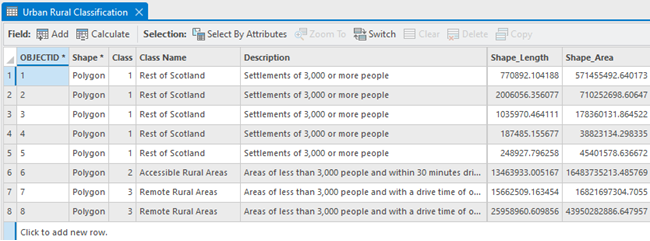
The layer has three land classifications. The values in the Class field correspond to unique class names and descriptions. People live in accessible rural areas, remote rural areas, or the rest of Scotland (settlements of 3,000 or more people).
Tip:
To widen a field, drag the vertical separator between field names.
- Close the attribute table.
- Right-click the Urban Rural Classification layer and click Symbology
 .
.The Symbology pane appears.
- In the Symbology pane, on the Primary symbology tab
 , click the Primary symbology drop-down arrow and click Unique Values
  . Confirm that the Field 1 value is set to Class.
Unique values in the Class field of the attribute table will be used to symbolize the layer. You could also symbolize on the Class Name or Description fields.
- In the lower half of the pane, on the Classes tab, click Add all values
 .
.The map updates to show the three land classifications in unique colors.
- In the Symbology pane, on the Classes tab, in the Symbol column, click the symbol for value 1. This value represents areas defined by settlements of 3,000 or more people.
The Symbology pane changes to show options for formatting polygon symbols.
- At the top of the pane, click the Properties tab. On the Symbol tab
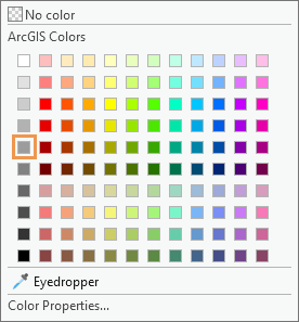
 , click the Color button and click Gray 40%. Set the Outline width value to 0. At the bottom of the pane, click Apply.
The symbol is updated on the map and in the Contents pane.
- At the top of the pane, click Return to primary symbology page
 .
. - On the Classes tab, in the Symbol column, click the symbol for value 2. This value represents rural areas within a 30-minute drive of a large settlement.
The Symbology pane presents formatting options.
- On the Properties tab, on the Symbol tab
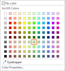
 , click the Color button and click Sage Dust. Set the Outline width value to 0. Click Apply.
- Click Return to primary symbology page
 and click the symbol for value 3. This value represents remote rural areas.
This time, instead of choosing a color from the palette, you'll make your own color.
- On the Properties tab, on the Symbol tab
 , click the Color button and click Color Properties.
 The Color Editor dialog box appears.
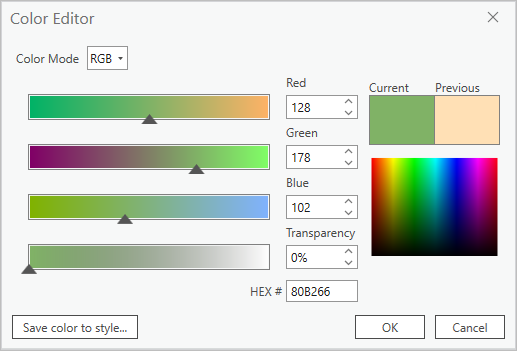
- On the Color Editor dialog box, click the Color Mode drop-down arrow and click RGB. Set the values as shown below, and press the Enter key after each change.
- Red: 128.
- Green: 178.
- Blue: 102.
- Click OK on the Color Editor dialog box. In the Symbology pane, set the Outline width value to 0. Click Apply.
- Click Return to primary symbology page
 . On the Classes tab, click More and uncheck Include all other values.
Tip:
In a layer with many unique values, you may want to assign unique symbols to a few important features and a generic symbol, such as a gray fill, to the rest. That is the purpose of the Include all other values symbol. However, with only a few unique values, you don't need it.
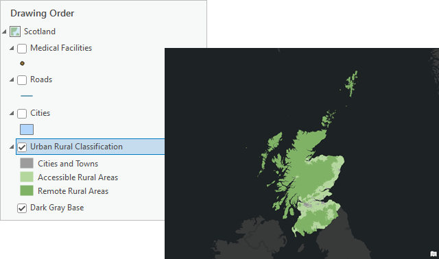
- On the Classes tab, in the Label column, double-click the value 1 to make the label editable. Change the text to Cities and Towns and press the Enter key.
After you commit the label change, the label for value 2 is automatically editable.
- For value 2, change the label to Accessible Rural Areas and press the Enter key. For value 3, change the label to Remote Rural Areas and press the Enter key.
In the Contents pane, the layer shows the header Class above the updated symbols. The descriptive labels make this header unnecessary.
- In the Contents pane, under Urban Rural Classification, click the Class header and click again to make it editable. Press the Delete key and press the Enter key.
- On the Quick Access Toolbar, click Save Project
 .
.
Filter the Roads layer
The Roads layer is very dense. This creates visual clutter and causes the layer to draw slowly. You'll apply a definition query to filter the layer. Roads not specified by the definition query won't draw on the map and won't appear in the layer attribute table. Definition queries suppress data but don't delete it—you can remove a definition query at any time to access the full set of features and records.
- In the Contents pane, turn on the Roads layer.
- Right-click the Roads layer and click Attribute Table
 .
.The status bar at the bottom of the table shows more than 400,000 features in the layer. There aren't actually that many roads in Scotland—many of the features represent different segments of the same road.
- In the table, right-click the Road Type field heading and click Visualize Statistics
 .
.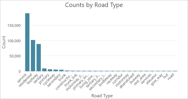
A bar chart appears showing the counts for each road type. The vast majority are service roads, residential roads, or footways. These are small, local roads that you don't need in the map. Your definition query will include five important road types—motorway, trunk, primary, secondary, and tertiary—and exclude the rest.
Tip:
Hover over a data marker to see the exact number of features it represents.
- Close the chart view, the Chart Properties pane, and the attribute table.
In the Contents pane, the Counts by Road Type chart appears under the Roads layer. You can right-click the chart and click Open
 to reopen it.
 - In the Contents pane, double-click the Roads layer to open its properties.
- On the Layer Properties dialog box, click the Definition Query tab. Click New definition query.
A definition query consists of a field name, a logical condition, and a value (or values) to test against the condition.
- In the Query 1 expression box, click the Where drop-down arrow and click Road Type. Click the condition drop-down arrow and click includes the value(s). Click the values drop-down arrow and check the following boxes:
- motorway
- primary
- secondary
- tertiary
- trunk
- Click outside the drop-down list to close it. Click Apply on the expression box.

- Click OK on the Layer Properties dialog box.
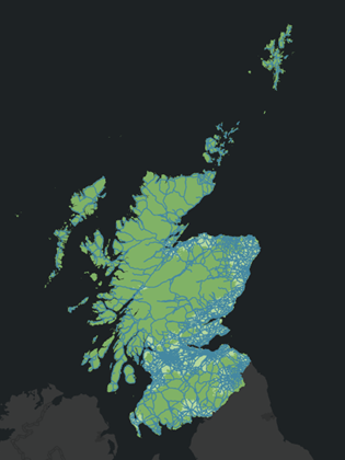
There are now fewer than 20,000 road features in the layer.
Tip:
To check the number of records, open the attribute table and click Load All at the bottom of the table.
Symbolize the Roads layer
You'll choose unique symbols for the five road types included in your definition query. You'll set the feature drawing order to make major roads display on top of minor roads. Finally, you'll set visibility ranges for the road symbol classes so that smaller roads display only at larger map scales.
- In the Contents pane, right-click the Roads layer and click Symbology
 . In the Symbology pane, on the Primary symbology tab
  , click the Primary Symbology drop-down arrow and click Unique Values
  .
. - Confirm that the Field 1 drop-down list is set to Road Type. If necessary, click the drop-down arrow and select this value.
You'll symbolize the layer on the attributes in the Road Type field. The available attributes are those you specified in the definition query.
- On the Classes tab, click Add all values
 .
. - Click More and uncheck Include all other values.
- In the list of values, click the row containing the value trunk to select it—but don't click the trunk symbol itself. Click Move selected values up
 until the row is just under motorway.
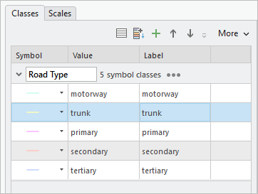
Your symbol colors may be different. The five road symbol classes are now ordered by importance. This order is reflected in the Contents pane, although not in the display of features on the map.
- In the Contents pane—not the Symbology pane—under the Roads layer, click the symbol for motorway.
The Symbology pane shows options for formatting line symbols
- At the top of the pane, click the Gallery tab if necessary. In the search box, type highway and press the Enter key.
- In the search results, under ArcGIS 2D, hover over the first Highway symbol. (Its category is Scheme 1.) Click the symbol.
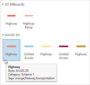
- At the top of the pane, click the Properties tab. Set the Line width value to 2 pt and press the Enter key. Click Apply.
- In the Contents pane, click the other Road Type symbols in turn and change their values in the Symbology pane using the table below as a guide.
Tip:
Search for symbols by name on the Gallery tab, set their properties on the Properties tab, and click Apply to apply your changes.
Value Symbol Color Line width trunk
Major Road (ArcGIS 2D Scheme 1)
Default
2 pt
primary
Minor Road (ArcGIS 2D Scheme 1)
Default
1.5 pt
secondary
Default
Yucca Yellow (row 1, column 5)
1 pt
tertiary
Default
Yucca Yellow (row 1, column 5)
0.5 pt
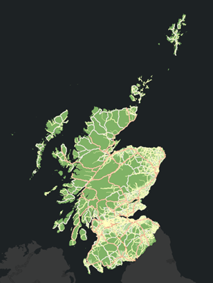
The roads don't draw in their symbol class order—if they did, the motorways would be on top of the other roads. By default, features in a layer draw in their database order (the order of their Object ID values in the attribute table). You'll override this behavior by turning on symbol layer drawing.
- In the Symbology pane, click Return to primary symbology page
 . At the top of the pane, click the Symbol layer drawing tab
  and click Enable symbol layer drawing.
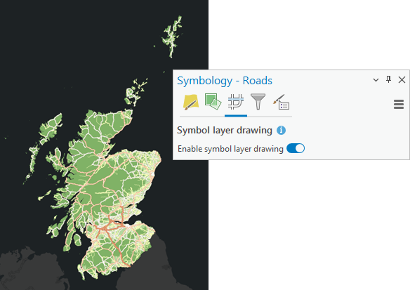
The road features now draw in the order that corresponds to their position in the Contents pane. Motorways draw on top, trunk roads draw underneath motorways, and so on.
Next, you'll set scale ranges for the symbol classes so the roads draw at appropriate map scales.
- At the top of the Symbology pane, click the Primary symbology tab
 . In the lower half of the pane, click the Scales tab.
By default, each road type is visible at all map scales. You may need to widen the Symbology pane to see the full scale range setting.
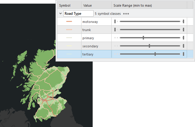
- In the Scale Range (min to max) column, set the slider positions as follows:
- In the primary road type row, drag the left slider to 1:500,000.
- In the secondary row, drag the left slider to 1:100,000.
- In the tertiary row, drag the left slider to 1:50,000.
On the map and in the Contents pane, only motorways and trunk roads appear. Other roads do not draw until you zoom in to larger scales.
- On the ribbon, on the Map tab, in the Navigate group, click Bookmarks
 . Click the Glasgow bookmark.
The primary roads now draw in addition to the motorways and trunk roads.
Tip:
The primary roads draw at map scales of 1:500,000 and larger. If you don't see them, you may need to zoom in. You can set the map scale directly by clicking the scale drop-down arrow at the bottom of the map view.
- Go to the River Clyde bookmark.
You should see the secondary roads. Depending on your map scale, you may also see the tertiary roads.
- If necessary, zoom in to a map scale of 1:50,000 or larger to see the tertiary roads.
- Go back to the Full Extent bookmark.
- On the Quick Access Toolbar, click Save Project
 .
.
Symbolize the Medical Facilities layer
You'll choose a symbol for the medical facilities, customize it with transparency, and use feature clustering to aggregate symbols that are close together into single symbols that are sized proportionally.
- In the Contents pane, turn on the Medical Facilities layer.
- Click the Medical Facilities symbol. In the Symbology pane, click the Gallery tab if necessary.
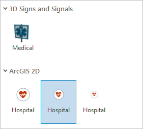
- In the search box, type hospital and press the Enter key. Under ArcGIS 2D, click the medium-sized Hospital icon. (Its category is POI-Medium.)
- Click the Properties tab and click the Layers tab
 under it.
Symbols can be composed of one or more symbol layers. The Hospital symbol is composed of two symbol layers—a red heart on top of a white circle. These symbol layers can be modified independently.
- Click the white circle to select the symbol layer.
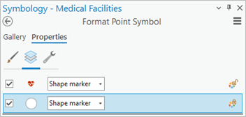
- Under the symbol layers, expand the Appearance section if necessary. Click the Color button and click Color Properties.
- On the Color Editor dialog box, change the Transparency setting to 50% and press the Enter key. Click OK on the Color Editor and click Apply in the Symbology pane.
The white circles are now partially transparent.
- In the Contents pane, ensure that the Medical Facilities layer is selected. On the ribbon, click the Feature Layer tab. In the Drawing group, click Aggregation
 and click Clustering
  .
.On the map, clusters of medical facilities are now represented by proportionally sized symbols. The clusters update dynamically as you zoom in and out on the map.
- At the top of the Symbology pane, click the Clusters tab and click the Cluster settings tab
 under it.
 - Experiment by moving the Clustering radius slider to different positions.
As the clustering radius becomes higher, more symbols are aggregated into fewer clusters.
- Move the slider to a position about one-third of the distance from the low end.
- Uncheck the Show cluster text check box to remove the count of medical facilities from the cluster symbols.
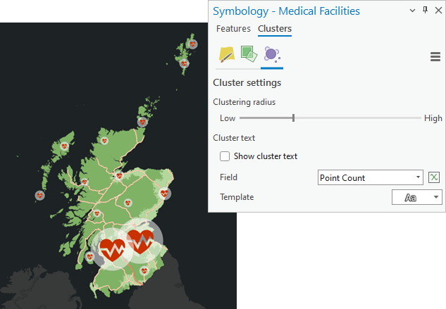
Your results may look different depending on where you placed the Clustering radius slider. - Zoom in and out on the map to see the number and size of clusters change.
- Click the Map tab on the ribbon and go to the Glasgow bookmark.
- On the Quick Access Toolbar, click Save Project
 .
.
Label the Cities layer
You'll turn on labels for the Cities layer so map readers can identify population centers. By default, all the labels in a layer belong to a single label class, which means that they share the same set of properties, such as font size, color, and placement. You'll create a second label class so you can apply different visibility ranges to large and small cities. You'll also change the default label symbology.
- In the Contents pane, turn on the Cities layer and drag it to the top of the drawing order, above the Medical Facilities layer.
- Right-click the Cities layer and click Attribute Table
 .
. - Right-click the Population 2015 field and click Sort Descending
 .
.Five of the 13 cities have populations of more than 100,000. You'll use this number to define separate label classes for large and small cities.
- Close the attribute table.
- In the Contents pane, right-click the Cities layer and click Label
 .
.Glasgow and the surrounding cities are labeled with their names.
- Ensure that the Cities layer is selected in the Contents pane. On the ribbon, click the Labeling tab. In the Label Class group, click SQL Query
 .
.The Label Class pane appears. You'll construct the SQL query in the same way you previously made a definition query for the Roads layer.
- In the Label Class pane, click New expression.
- In the expression box, click the Where drop-down arrow and click Population 2015. Click the condition drop-down arrow and click is greater than or equal to. Click in the values box and type 100,000.

- Click Apply.
On the map, only cities with populations of 100,000 or more are labeled. At the current bookmark, this includes Glasgow and Wishaw.
- At the top of the Label Class pane, click the Symbol tab and confirm that the General tab
 is selected under it.
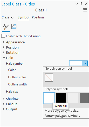
You'll add a halo to help the labels stand out against different parts of the map. A halo is a background fill color that separates the label text from map features.
- Scroll down in the Label Class pane if necessary and expand Halo. Click the Halo symbol drop-down arrow. Under Polygon symbols, click the White fill symbol. Confirm that the halo size is 1 pt.
- Click Apply.
Now you'll create a second label class to represent the small cities.
- On the ribbon, on the Labeling tab, in the Label Class group, click the Class drop-down arrow and click Create label class.
- On the Create New Label Class dialog box, type Small Cities and click OK.
By default, all cities are labeled in the new label class. This means that the large cities now have duplicate labels.
- In the Label Class pane, confirm that Small Cities is the active label class. (Its name appears at the top of the pane.) Ensure that the Symbol tab is selected and the General tab
 is selected under it.
 - Change the halo symbol to the White fill symbol as you did before. Click Apply.
- At the top of the Label Class pane, click the Class tab. If necessary, click the SQL query tab
 under it. Click New expression.
 - Create the following expression: Where Population 2015 is less than 100,000. Click Apply.
On the map, the duplicate labels for Glasgow and Wishaw no longer appear.
- On the ribbon, on the Labeling tab, in the Visibility Range group, click the Minimum Scale drop-down arrow
 and click 1:500,000.
Labels for the large cities display at all scales. Labels for the small cities display only when the map is zoomed in to 1:500,000 and larger scales.
- At the bottom of the map view, click the map scale drop-down arrow and click 1:1,000,000.
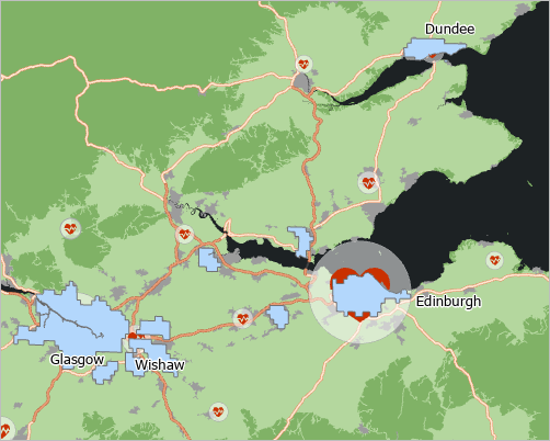
At this scale, only labels for large cities display.
- On the Quick Access Toolbar, click Save Project
 .
.
Symbolize the Cities layer
You don't need to show the polygon features in the Cities layer because the Urban Rural Classification layer already includes a symbol class for cities and towns. You'll make the features in the Cities layer transparent so that only their labels are visible.
- In the Contents pane, click the symbol for the Cities layer.
The Symbology pane displays options for formatting polygon symbols.
- Click the Properties tab and click the Symbol tab
 under it. Click the Color button and click No color. Change the Outline width setting to 0 pt and press the Enter key. Click Apply.
The city features no longer display on the map.
- In the Contents pane, click the Cities layer to select it. Press the F2 key, change the layer name to City Labels, and press the Enter key.
- On the ribbon, click the Map tab and go to the Full Extent bookmark.
You should see one or more city labels. At the current map scale, the size of the cluster symbols around Glasgow and Edinburgh may suppress the labels for those cities. You can experiment with the clustering radius slider for the Medical Facilities layer to find an optimal setting.
- On the Quick Access Toolbar, click Save Project
 .
.
Explore the multiscale map
You'll explore the map at small, medium, and large scales.
- In the Contents pane, confirm that all the map layers are turned on.
- On the ribbon, click the Map tab. In the Navigate group, click Bookmarks
 . Click the Glasgow bookmark to view the map at a medium scale.
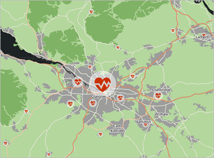
In the Contents pane, the maximum cluster value for the medical facilities has decreased. The primary road type appears on the map and as a symbol class in the Contents pane.
- Go to the River Clyde bookmark.
You should see the secondary roads draw on the map. If necessary, zoom in until your map scale is 1:50,000 or larger to see the tertiary roads. At this scale, most of the medical facility symbols represent individual locations rather than clusters.
- Pan and zoom to explore different parts of the map at different scales. When you're finished, go to the Full Extent bookmark.
Improve accessibility for color vision deficiencies
Color vision deficiencies affect approximately 8 percent of men and 0.5 percent of women. You'll check the map's accessibility for people with three of the four primary types of color vision deficiencies. The Color Vision Deficiency Simulator simulates the view of people with green-blind, red-blind, blue-blind, and full color-blind color vision deficiencies.
- On the ribbon, click the View tab. In the Accessibility group, click the Color Vision Simulator drop-down arrow and click Deuteranopia
 .
.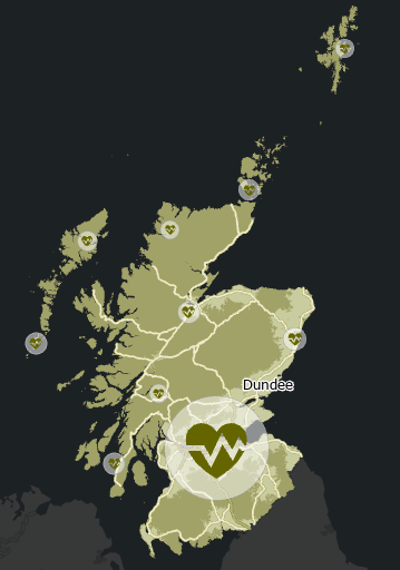
Deuteranopia (green blindness) is the most common color vision deficiency and results in confusion between green, red, and yellow hues. These hues are also easily confused by people with protanopia (red blindness). It's important that map symbols can be distinguished from each other in these different color environments.
- On the ribbon, click the Map tab and go to the Glasgow bookmark.
The Urban Rural Classification layer can still be interpreted by a person with deuteranopia. The color of the medical facilities symbol blends in more due to the confusion of red and green hues, but the symbol shape allows it to stand out. The main accessibility issue is with the motorway symbol.
- Go to the River Clyde bookmark.
The trunk, primary, secondary, and tertiary roads preserve adequate contrast with the background.
- Go to the Full Extent bookmark.
- In the Contents pane, under Roads, right-click the motorway symbol to open the color palette and click Cherry Cola.
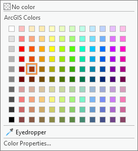
Motorways can now be distinguished on the map.
- On the ribbon, click the View tab. Click the Color Vision Simulator drop-down arrow and click Protanopia
 (red blindness) and Tritanopia
  (blue blindness).
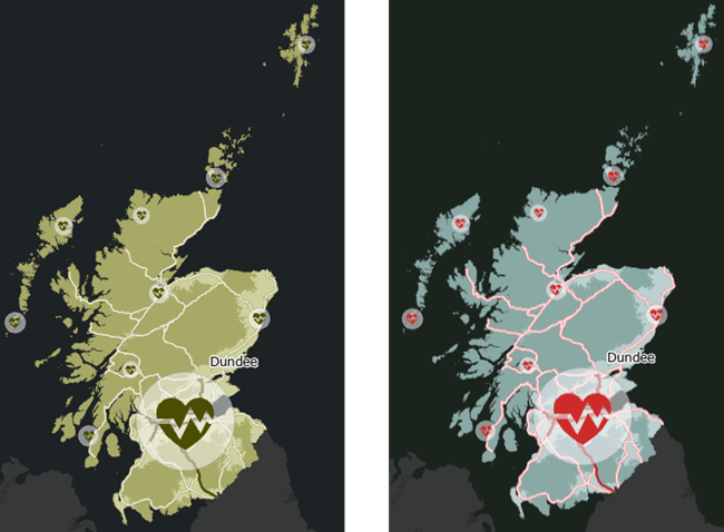
The map can be interpreted by viewers with the most common color vision deficiencies.
Note:
You can click Color Vision Simulator and click Achromatopsia to simulate full color-blindness and view the map in grayscale. Achromatopsia is very rare compared to other color vision deficiencies.
- Click the upper part of the Color Vision Simulator button to deselect it.
The map displays without simulated color vision deficiencies.
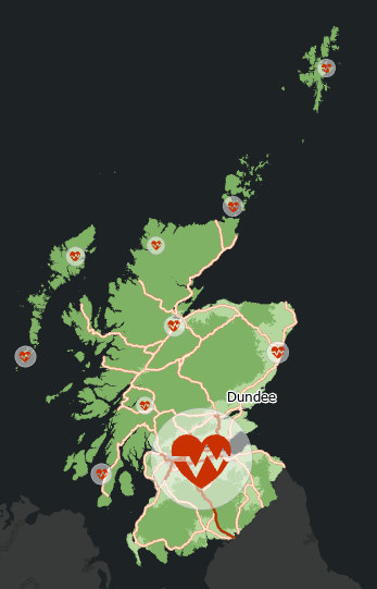
- On the Quick Access Toolbar, click Save Project
 .
.
To make your map available to other ArcGIS Pro users, you can share it as a map package. To make it available to anyone with an internet connection, you can share it as a web map. Go to the Share a web map tutorial to follow those steps in detail. To learn about preparing a map layout for print or export, follow the Make a layout tutorial.
