Symbology is the use of symbols to represent the features and attributes of a map layer. For example, in a layer of cities, black circles might symbolize the cities. The size of the circles might be varied to symbolize each city's population. Symbols are defined by visual properties such as shape, size, color, spacing, and (in 3D) perspective height.
Overview
- This video was created with ArcGIS Pro 3.1.
In this tutorial, you will symbolize point, line, and polygon features; customize symbols and set visibility ranges; and apply Unique Value symbols to bus routes. You will also apply heat map symbology to population density.
- Estimated time: 40 minutes
- Software requirements: ArcGIS Pro Basic
Note:
The quick-start tutorials are updated at each software release. For the best experience, use an online help version that matches your software version.
Open the project
In this project, you'll make a map of bus stops, bus routes, and population density in Christchurch, New Zealand.
- Start ArcGIS Pro and sign in if necessary.
- Open a browse dialog box to search for the project in one of the following ways:
- On the start page, click Open another project
 .
. - In an open project, click the Project tab on the ribbon. In the list of side tabs, click Open. On the Open page, click Open another project
 .
.

- On the start page, click Open another project
- On the Open Project browse dialog box, in the navigation pane, under Portal
 , click ArcGIS Online
  .
.Note:
If you are signed in to ArcGIS Enterprise
 , you must set your active portal to ArcGIS Online to access the tutorial data. If you can't do this, you can download the data from a browser.
 - At the top of the dialog box, in the Search box, type Symbolize map layers and press the Enter key.
- In the list of search results, click Symbolize map layers to select the project package.
Note:
If there is more than one project package with this name, select the package with the Authoritative badge
 . In the Owner column, the owner name is ArcGISProTutorials. If you don't get any results, see No search results are returned.
 - Click OK.
The project opens with a map view of New Zealand. You'll zoom in to the study area of Christchurch. With a population of about 400,000, Christchurch is the second-largest city in New Zealand.
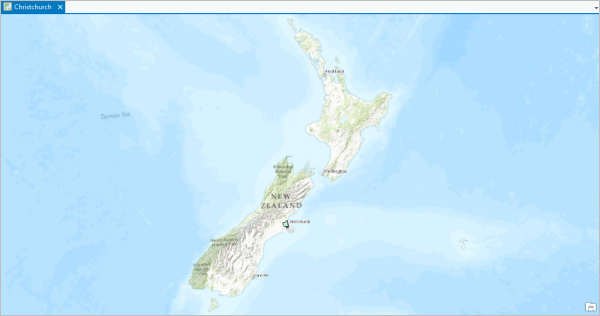
- On the ribbon, click the Map tab if necessary. In the Navigate group, click Bookmarks
 and click Christchurch Urban Area.
The map zooms in to the urban area. The Urban Area layer is symbolized with a light-green fill color and a black outline.
Symbolize the urban area
The purpose of the Urban Area layer is to define the study area boundary. The solid fill, however, obscures the basemap. You'll change the symbol to make the interior area hollow. You'll also give the boundary a softer, shaded appearance.
- On the ribbon, click the View tab. In the Windows group, click Pane Sets
 and click Mapping
  .
.This ensures that the Contents and Catalog panes are open and that other panes are closed.
- In the Contents pane, click the Urban Area layer to select it.
- On the ribbon, click the Feature Layer tab. In the Drawing group, click Symbology
 .
. Note:
The Symbology button is a split button. Click the top half of the button (the icon) unless otherwise noted.
The Symbology pane appears. At the top of the pane, the Primary symbology tab is selected
 . The primary symbology method is Single Symbol, which means that all features in the layer are drawn with the same symbol. (In this case, the layer only has one feature.)
 - In the Symbology pane, next to Symbol, click the symbol (a light green rectangle with a black outline).
The pane changes to show symbol formatting options.
- At the top of the pane, click the Gallery tab if necessary.
- Next to the search box, click the All styles drop-down arrow and click Project styles.
The Project styles setting includes the styles ArcGIS Pro adds to the project by default, as well as any other styles you add. The All styles setting includes all system styles installed with ArcGIS Pro. Choosing Project styles narrows the scope of symbol searches.
- In the search box, type extent transparent and press the Enter key.
In the ArcGIS 2D style, several symbols are available with different colors and outlines. You can hover over the symbols to get more information.
- Click the Extent Transparent Gray symbol to select it.
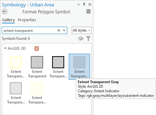
Your symbols may be arranged differently. The symbology for the Urban Area layer updates on the map and in the Contents pane. You can see through the symbol to the basemap underneath. This is a good start, but your goal is to create the effect of a shaded boundary with a transparent interior.
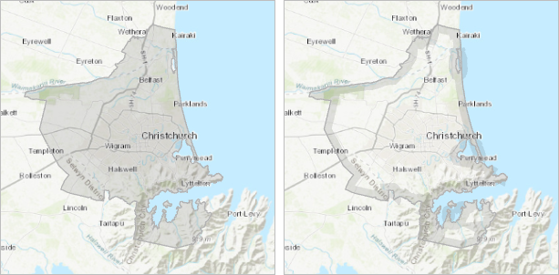
First image: The urban area is currently symbolized with a partly transparent gray fill. Second image: The desired effect is a shaded boundary with a fully transparent interior. - At the top of the Symbology pane, click the Properties tab.
The Properties tab has three graphical tabs under it. On the Symbol tab
 , you can change symbol properties such as fill color, outline color, and outline width.
 - Click the Layers tab
 .
.On this tab, you can change properties of the graphical elements, or symbol layers, that the symbol is composed of. This gives you more control over the symbol's appearance. This symbol is composed of two symbol layers: a stroke and a fill.
- Click the Structure tab
 .
.On this tab, you can change the symbol's structure by adding and removing symbol layers. You can also apply symbol effects. In this case, you'll add a donut effect to the fill layer. The donut effect restricts the gray fill to a ring at the edge of the polygon.
- On the Structure tab, under Layers, under the gray fill symbol layer, click Add effect. On the drop-down menu, click Donut.
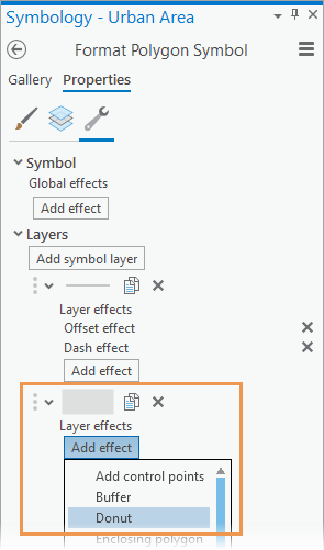
The effect is previewed in the window at the bottom of the pane. Now that you have applied the effect, you'll specify its width on the Layers tab.
- Click the Layers tab
 .
. - Click the Solid fill symbol layer to work with its properties. Expand the Donut effect heading and change the Width setting to 6 pt.
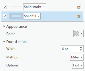
The symbol preview is updated at the bottom of the pane.
- Click Apply.
The new symbology is applied to the map.
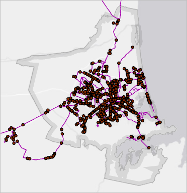
- In the Contents pane, turn on the Bus Stops and Bus Routes layers.
You'll change the symbology of both layers in the next sections. First, you'll choose a more neutral basemap.
- On the ribbon, click the Map tab. In the Layer group, click Basemap
 and click Light Gray Canvas.
The light gray canvas basemap includes two layers: the Light Gray Base layer at the bottom of the Contents pane and the Light Gray Reference layer at the top. For this map, you don't need the reference layer.
- In the Contents pane, click the Light Gray Reference layer to make it the only selected layer. Right-click the selected layer and click Remove
 .
.
Before continuing, you'll save your changes.
- On the Quick Access Toolbar, click Save Project
 .
.
Symbolize the bus stops
The current symbol for the Bus Stops layer is a small dark circle. You'll replace it with a more appropriate symbol.
- In the Contents pane, click the Bus Stops layer to select it.
- In the Symbology pane, next to Symbol, click the symbol.
The pane presents formatting options for point symbols.
Tip:
If you previously closed the Symbology pane, you can open the pane directly to the symbol formatting options by clicking the symbol for the Bus Stops layer in the Contents pane.
- At the top of the pane, click the Gallery tab.
- In the search box, type bus and press the Enter key.

In the ArcGIS 2D style, symbols for bus stations are found. These symbols are suitable for bus stops, too.
- Click the smallest bus station symbol to select it.
The map and Contents pane update with the new symbol. You'll change the symbol properties.
- In the Symbology pane, click the Properties tab and click the Symbol tab
 under it.
 - Under Appearance, click the Color drop-down arrow. On the color palette, click Cabernet (last row, last column).
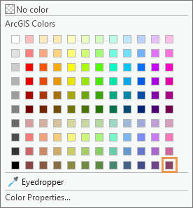
Tip:
When you hover over a color square, its name appears.
- Change the size to 8 pt and press the Enter key. Click Apply.
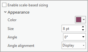
- At the bottom of the Symbology pane, under the symbol preview, click the drop-down arrow and change the magnification setting to Zoom to fit.
The symbol preview shows that the Cabernet color is applied to the bus icon but not to the outline.
- Click the Layers tab
 .
.The Bus Station symbol is composed of two marker symbol layers: the bus icon and a white circle with a gray outline.
- Click the white circle symbol layer to select it.
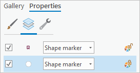
- Under Appearance, click the Outline color drop-down arrow and click Cabernet (last row, last column).
In the preview window, the icon and the outline are now the same color.
- Click Apply.
The symbol is updated on the map and in the Contents pane. At the current map scale, the symbols clutter the map. You'll set a visibility range for the layer so the symbols display only when the map zooms in.
- In the Contents pane, select the Bus Stops layer if necessary.
- On the ribbon, click the Feature Layer tab. In the Visibility Range group, click the drop-down arrow next to Minimum Scale
 and click 1:24,000. (If this value doesn't appear in the list, you can type it in the box.)
The symbols disappear from the map. In the Contents pane, the layer's check mark is gray. This means that the layer is turned on but not visible at the current map scale.
- In the Contents pane, right-click the Bus Stops layer and click Zoom To Make Visible
 .
.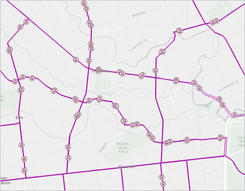
The map zooms in to a scale of 1:24,000 and the bus stops display.
- On the ribbon, click the Map tab. In the Navigate group, click Previous Extent
 to return to the full urban area.
 - On the Quick Access Toolbar, click Save Project
 .
.
Symbolize the bus routes
The bus routes are currently drawn with a single symbol. The attribute table for the layer contains attributes such as route names, route directions, and route types that can be used to symbolize the features in more meaningful ways.
- In the Contents pane, click the Bus Routes layer to select it.
- Right-click the selected layer and click Attribute Table
 .
.The attribute table opens. You'll symbolize the routes according to their values in the Type field.
- Right-click the Type field and click Visualize Statistics
 .
.A chart is created showing the four route types.
- Suburban links connect suburbs to each other.
- Metro lines follow major roads.
- City connectors connect suburbs to the city.
- Ferries connect the suburb of Lyttelton to Diamond Harbour.
You'll represent each route type with a different color on the map.
Tip:
To see the full names of the route types in the chart, click the Axes tab in the Chart Properties pane. Under X-axis, increase the label character limit to 14.
- Close the Bus Routes - Counts by Type chart, the Bus Routes attribute table, and the Chart Properties pane.
- In the Symbology pane, click the Primary symbology drop-down arrow and click Unique Values.
- Click the Field 1 drop-down arrow and click Type.
In the lower half of the pane, on the Classes tab, symbols are assigned to the unique values in the Type field. The map and the Contents pane are updated with these symbols.
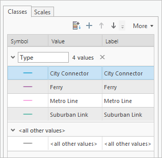
Your symbol colors may be different. There is also a gray symbol representing all other values. You don't need this symbol for this layer.
- In the Symbology pane, on the Classes tab in the lower half of the pane, click More and uncheck Include all other values.
The <all other values> symbol is removed.
Tip:
The <all other values> symbol is used for features that you want to display but don't need to differentiate. For example, suppose that Metro Line routes are the focus of your map and the other routes are background information. You can remove the other route types on the Classes tab by right-clicking them and clicking Remove
 . The features for the removed routes still draw on the map but are symbolized with the <all other values> symbol. See Unique values for more information.
 - Click More again and click Format all symbols.
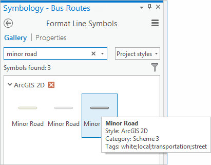
- At the top of the pane, click the Gallery tab. In the search box, type minor road and press the Enter key.
- In the ArcGIS 2D style, click the Minor Road symbol with the black outline.
You'll apply a color scheme to the new symbol.
- At the top of the Symbology pane, click Return to primary symbology page
 .
. - On the Primary symbology tab
 , click the Color scheme drop-down arrow. At the bottom of the list of color schemes, check the Show names check box.
Tip:
You can also hover over a color scheme to see its name.
- Click the Dark 2 (4 classes) scheme.
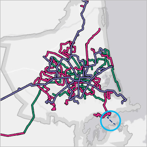
You'll change the Ferry symbol because ferry routes are conventionally symbolized with dashed lines.
- In the lower half of the pane, click the line symbol for Ferry to show the symbol gallery.
- In the search box, type ferry and press the Enter key. In the ArcGIS 2D style, click the Ferry symbol.
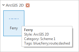
On this map, the ferry symbol would look better if it were darker.
- At the top of the pane, click the Properties tab. On the Symbol tab
 , under Appearance, click the Color drop-down arrow and click Dark Navy. Click Apply.
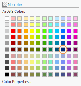
The symbol updates in the Contents pane and on the map.
- On the Quick Access Toolbar, click Save Project
 .
.
Improve the symbology with symbol layer drawing
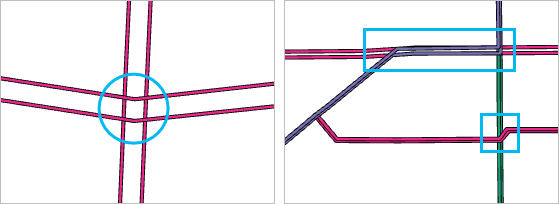
The bus route symbology can be further improved. You'll use symbol layer drawing for more control over the symbology at road crossings and overlaps. For example, in the first image below, suburban link routes cross each other. You'll remove the road casings (black outlines) at the intersections. In the second image, a blue metro line and a red suburban link share the same route, and a suburban Link crosses a city connector. You'll specify which features in the layer draw on top of which others.
- At the top of the Symbology pane, click Return to primary symbology page
 .
. - At the top of the pane, click the Symbol layer drawing tab
 .
. - Click Enable symbol layer drawing.

- On the Basic tab, drag Metro Line to the top of the Drawing Order list.
- Drag Ferry to the bottom of the list.
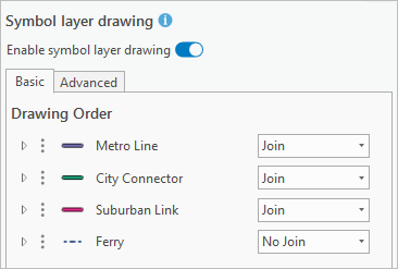
The map updates as you change the drawing order. Metro line features now draw on top of other bus routes, which means that a metro line is never visually interrupted by another route. Likewise, city connector features draw on top of suburban link features.
Note:
Symbol drawing order is independent of the order of symbol classes in the Contents pane. In the Contents pane, the symbol classes, representing the four unique route types, are still in their default alphabetical order. You can change this order by dragging symbol classes up and down on the Primary symbology tab
 .
.In the Symbology pane, notice that three of the routes are set to Join. This setting removes road casings where features of the same route type intersect. You'll change the setting to Join and Merge to remove road casings at intersections between different route types.
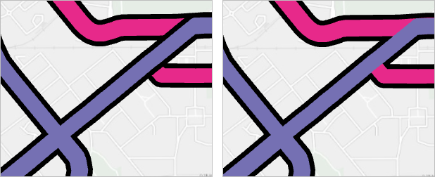
In the first image, the Join setting removes road casings where features of the same route type intersect. In the second image, the Join and Merge setting also removes road casings where features of different route types intersect. (The casings are not actually removed—they are drawn over.) - Click the drop-down arrow next to City Connector and click Join and Merge. Click the drop-down arrow next to Suburban Link and click Join and Merge.
The map updates to reflect the settings. You don't see a close-up view of the effect because symbols and text, by default, remain the same size on your map as you zoom in and out. Optionally, you can set a map reference scale to make symbols increase or decrease in size as you zoom the map. However, this tutorial assumes that no reference scale is set.
Note:
The Join and Merge setting affects the drawing behavior of a symbol in relation to the symbol above it. There is no Join and Merge setting for the Metro Line symbol because it is at the top of the drawing order. Both the Join and Join and Merge settings affect the drawing relationship of a symbol's component symbol layers (in this case, the two stroke layers, representing roads and casings, that make up the bus route symbols). The only available setting for the Ferry symbol is No Join because this symbol is composed of a single stroke layer. For more information, see Symbol layer drawing.
- Zoom the map to a larger scale, such as 1:50,000, for a better look. Pan to different parts of the urban area.
Tip:
To zoom to an exact scale, type a value in the scale box at the bottom of the map view or choose a value from the drop-down list.
- When you're finished, zoom to the Christchurch Urban Area bookmark.
- On the Quick Access Toolbar, click Save Project
 .
.
Symbolize population
Finally, you'll symbolize the population in the Christchurch urban area to visualize the relationship between bus routes and population.
- In the Contents pane, turn on the Population layer.
A dense layer of points covers the urban area. Each point is the center of a meshblock. A meshblock, like a United States census block, is a small area for which census data is collected. In this layer, each point stores the population of its meshblock.
- On the map, click a population point.
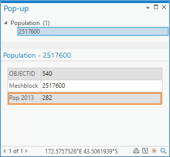
The Pop-up pane shows the population for the meshblock associated with the point. By drawing the layer as a heat map, you can see where population is concentrated.
- Close the Pop-up pane.
- In the Contents pane, click the Population layer to select it if necessary.
- At the top of the Symbology pane, click the Primary symbology tab
 if necessary. Click the Primary symbology drop-down arrow and click Heat Map.
The heat map appears. At the moment, it represents the density of the points, not their population values.
- In the Symbology pane, click the Weight field drop-down arrow and click Pop 2013.
The heat map now represents population density. Yellow areas are high density, red and purple are in the middle, and blue areas are low density. You'll set the heat map to update dynamically when you zoom in and out on the map. You'll also increase the variation in the map by changing the Radius setting.
- Click the Method drop-down arrow and click Dynamic.
- Change the Radius to 15 and press the Enter key.
The larger the radius value, the more generalized the pattern. You can experiment with different settings—no value is right or wrong.
- In the Contents pane, drag the Population layer under the Bus Routes layer. (Drag it under the chart associated with the Bus Routes layer.) Ensure that the Population layer is still selected in the Contents pane.
- On the ribbon, click the Feature Layer tab. In the Effects group, in the Transparency box
 , type 65 and press the Enter key.
 - In the Visibility Range group, click the drop-down arrow next to Maximum Scale
 and click 1:50,000 to set the maximum display scale for the heat map.
At scales larger than 1:50,000, the pattern is too local and the heat map looks bubbly.
- Zoom and pan to explore the map.
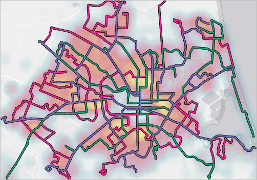
The bus routes correspond well to the populated parts of the urban area.
- On the Quick Access Toolbar, click Save Project
 .
.
In this tutorial, you used different primary symbology methods—Single Symbol, Unique Values, and Heat Map—to draw the layers in your map. You also worked with symbol layers and structure to enhance the symbology in many ways. There are more symbology methods to explore and many ways to customize symbols for your maps.
