Scatter plots allow you to visualize the relationship between two numeric variables, where one variable is displayed on the x-axis, and the other variable is displayed on the y-axis. For each record, a point is plotted where the two variables intersect in the chart. When the resulting points form a nonrandom structure, a relationship exists between the two variables.
Variables
Scatter plots are composed of two numbers, one for the x-axis and one for the y-axis. Additionally, a third numeric variable can be specified to proportionally size each point in the plot.
Note:
To improve performance, visual aggregation is applied when a scatter plot is created with more than 200,000 points. In this case, scatter plot points are aggregated into a 250 x 250 grid and each cell displays a maximum of one point. When visual aggregation is applied, the Tooltip Display Field and Proportional controls are disabled.
Multiple series
Scatter plots can be displayed with multiple series by setting a Split by category field. For example, in a dataset of crime incidents, a CrimeType field can be used to split the data into multiple series. The Series table will populate with each unique crime type (Theft, Vandalism, and Arson, for example), and the resulting chart will display three scatter plot series.
Display multiple series
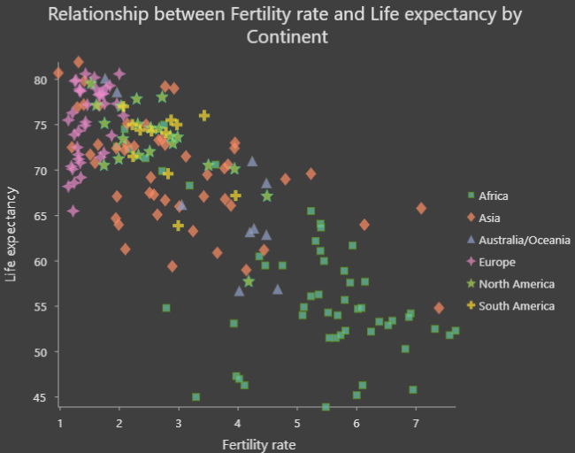
To configure a scatter plot with multiple series, use the Display multiple series as option on the Series tab in the Chart Properties pane. By default, multiple series are displayed with the Single chart option. In this representation, all series are drawn in the same plot area, but each series is assigned a unique color to allow comparisons between the different groups.
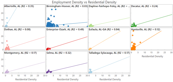
You can also view a scatter plot with multiple series as a grid chart (also known as small multiples) by selecting the Grid option. This option displays a matrix of smaller charts in which each mini chart only shows data for an individual series. Grid charts are helpful for comparing trends and patterns between different subgroups in data. You can customize the dimensions of a grid chart layout by setting the Mini charts per row numeric value. For example, setting Mini charts per row chart to 3 will display a maximum of three charts per row—the total number of rows in the grid will be determined by the number of series in the chart. Checking the Show preview chart check box allows you to dynamically explore each mini chart in greater detail by selecting one to view in the larger preview chart.

Series statistics
When a multiple series scatter plot is configured with the Grid option, the mini charts can be displayed using the Scatterplots, R-Squared, or Pearson's r options from the Display drop-down list on the Series tab. When the R-Squared or Pearson's r option is selected, the mini charts will display the statistical value, and the background will reflect the gradient color specified in the Color scheme drop-down list, which corresponds to the strength of the value. Use the Sort by and Sort direction drop-down lists to order the mini charts alphabetically, manually, or by a statistical value.
When mini charts are configured to display R² or Pearson's r values, p-value indicators for each series can be shown by checking the Show p-value check box. The following indicators are used to represent the three significance thresholds:
- ***—The p-value is less than 0.001.
- **—The p-value is less than 0.01.
- *—The p-value is less than 0.05.
When the p-value for a series is equal to or greater than 0.05, no p-value indicator will be displayed in the mini chart.
Note:
The t-distribution is used to calculate p-values.
Tooltip Display Field
The Tooltip Display Field drop-down menu can be used to show values for a specific field in the tooltip for each scatter plot point. For example, when plotting housing_cost and crime_rate, it may be helpful to select neighborhood for the Tooltip Display Field value so that the name of the neighborhood is displayed when you hover over an individual point.
Statistics
A regression equation is calculated and the associated trend line is plotted on scatter plots. The trend line models the relationship between the two variables, with both linear (Linear) and nonlinear (Exponential, Logarithmic, Power, and Polynomial) trend line options available. The R² value quantifies how well the data fits the model—though caution is advised when using R² for nonlinear models, since linearity is an assumption built-in to the R² calculation. To turn off the trend line, uncheck the Show trend line check box in the Chart Properties pane, or turn visibility on and off by clicking the item in the legend. To change the color of the trend line, click the trend line color swatch in the Chart Properties pane and choose a new color.
Learn more about regression analysis
Note:
Charts use the following formula for calculating R²:

where  is the actual value,
  is the predicted value, and
  is the mean of the actual values.
Correlation
For linear trends, when small x-values correspond to small y-values, and large x-values correspond to large y-values (line sloping up), it indicates a positive correlation. When small x-values correspond to large y-values, and large x-values correspond to small y-values (line sloping down), it indicates a negative correlation.
Note:
A correlation between x and y does not imply that x causes y.
Symbol
The options described in the subsections below control the chart symbolization and related settings.
Style
By default, scatter plot points use layer colors and inherit their outline and fill colors from the source layer symbology. By symbolizing a layer with an attribute other than either of the scatter plot variables, an additional dimension can be shown on the scatter plot visualization.
The point style can be customized on the Series tab in the Chart Properties pane by clicking the Symbol color patch in the Series table. Use the pop-up to configure the style, size, color, and transparency for point symbols. Alternatively, use the Color scheme drop-down list on the Series tab to apply a palette to the series in a chart.

To apply a common style to multiple series, select multiple rows in the Series table and click the Symbol color patch for one of the selected series.
Proportional size
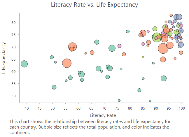
Use the Proportional drop-down list to size scatter plot points proportionally by a numeric attribute. Sizing scatter plot points proportionally based on a third numeric variable adds another dimension to the visualization, creating a bubble plot as shown in the following image:

Axes
The options described in the subsections below control the axes and related settings.
Axis bounds
Default minimum and maximum axis bounds are based on the range of data values represented on the axis. These values can be customized by providing a new axis bound value. Clicking the reset button reverts the axis bound to the default value.
Log axis
By default, scatter plot axes are displayed on a linear scale. One or both axes can be displayed on a logarithmic scale by checking the Log axis check box in the Axes section of the Chart Properties pane.
Logarithmic scales are useful when visualizing data with a large positive skew in which the majority of data points have a small value, with a few data points with very large values. Changing the scale of the axis does not change the value of the data, only the way it is displayed.
Linear scales are based on addition, and logarithmic scales are based on multiplication.
On a linear scale, each increment on the axis represents the same distance in value. For example, in the axis diagram below, each increment on the axis increases by adding 10.

On a logarithmic scale, increments increase by magnitudes. In the axis diagram below, each increment on the axis increases by multiplying by 10.

Note:
Logarithmic scales cannot display negative values or zero. If you log the axis of a variable with negative values or zero, those values will not appear on the chart.
Adaptive axis bounds
When a multiseries scatter plot is displayed with the Grid option, the axis bounds can be configured with the following options:
- Fixed—Applies the global minimum and maximum bounds to all mini charts.
- Adaptive—Adjusts to the local minimum and maximum bounds for each mini chart.
Grid intervals
Grid intervals for the x-axis and y-axis can be configured using the Interval controls. The default grid intervals will be calculated automatically.
Invert axis
Either axis of a scatter plot can be inverted by checking the Invert axis check box.
Number format
You can format the way an axis displays numeric values by specifying a number format category or defining a custom format string. For example, $#,### can be used as a custom format string to display currency values.
Appearance
The options described in the subsections below control the chart appearance and related settings.
Titles and description
The charts and axes default titles are based on the variable names and chart type. These can be edited on the General tab in the Chart Properties pane. You can also provide a value for the Description option, which is a block of text that appears at the bottom of the chart window.
Guides
Guide lines or ranges can be added to charts as a reference or way to highlight significant values. To add a new guide, go to the Guides tab in the Chart Properties pane, and choose whether you want to draw a vertical or horizontal guide. Click the arrow on the Add guide button, and select one of the following options:
- Create fixed value line or range guide—Draw a line or range guide at a fixed location. When this option is selected, provide a value for Value where you want the line to draw. To create a range, provide a to value.
- Create data-driven guide—Draw a data-driven guide. When this option is selected, use the Value drop-down list to select a field whose values will be used to calculate the location of the guide. Select an aggregation option to specify how these values are summarized.
- Create point or polyline guide—Draw a point or polyline guide. When this option is selected, edit the data table to input x- and y-values that will create the vertices to determine how the guide line is drawn. Enter one vertex to create a point guide. This option is only available when both axes are continuous.
Example
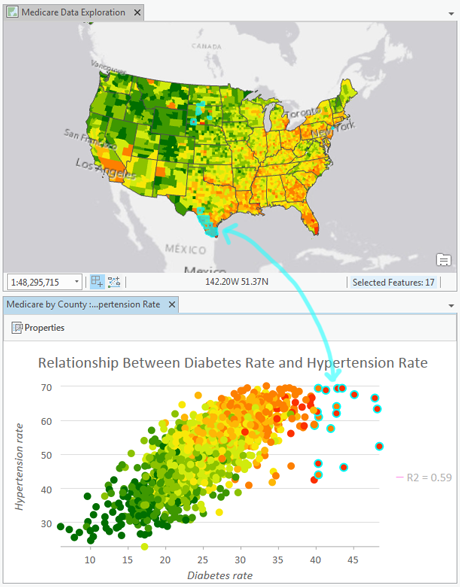
The scatter plot below visualizes the relationship between diabetes and hypertension among Medicare beneficiaries. Select features in the chart to see where they are located on the map.
- X-Axis—Diabetes rate
- Y-Axis—Hypertension rate
