Heat map symbology draws point features as a dynamic, representative surface of relative density. Use heat map symbology when you have many points that are close together and cannot be easily distinguished.
Since heat mapping is a representation of point distribution, it works best when there is a large number of point features, especially if their symbols overlap. When you have sparse distributions of points, consider drawing them by using an aggregation method instead.
Heat map symbology displays the relative density of points as a dynamic raster visualization using a color scheme to indicate density values. Ideally, the color scheme is a smoothly varying set of colors, ranging from cool (sparse density of points) to hot (high density of points). The density definition, and therefore the color values, change as you zoom in and out. The density is calculated using the kernel density method, the same algorithm used by the Kernel Density geoprocessing tool.
Each cell in the raster visualization has a value that represents relative density. This density is based on the feature count, but you can optionally choose a weight field to weight the density by an attribute. For example, the heat map symbology of point features representing apartment buildings can be weighted by the number of units in each building so that larger buildings have a greater contribution to the calculation of density.
Constant and dynamic rendering
There are two rendering methods to choose from:
Constant method—The definition of density (how each color in the scheme relates to a density value) remains constant, regardless of map extent. Use the Constant method to make accurate comparisons across different areas in the map if the map scale remains the same. If the map scale changes, you can lock the radius to maintain the expected density. This method is the default and matches the method used by ArcGIS Online.
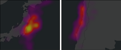
With the Constant method, you can compare subsets of data. Use the time slider, range slider, definition queries, or selection layers to establish subsets for comparison.

Heat map symbology of earthquakes shown for two different areas, at the same scale, using the Constant method. The density definition is constant, so the areas can be compared. The density definition is determined by the range of data currently in view at the time the heat map symbology is applied. Click the Regenerate density button
 to regenerate the density definition based on the current view.
 To compare distributions between two different layers, ensure that you are using identical symbology and density definitions. To do this, import the symbology from one layer into another. In the Symbology pane, click the menu button
 and click Import Symbology to open the Apply Symbology From Layer geoprocessing tool.
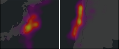
 Dynamic method—The density definition (how each color in the scheme relates to a density value) is recalculated each time the map scale or map extent changes to reflect only those features that are currently in view. The Dynamic method is useful to view the distribution of data in a particular area but is not valid for comparing different areas across a map. The densest areas in the current view draw with the "hottest" colors, but these areas may not necessarily be the densest in the entire dataset. For example, if you map a city's crime hot spots, zooming out shows a bigger picture of criminal activity across the city, while zooming in shows more detailed density patterns in particular neighborhoods without having to reset symbology properties.

Heat map symbology of earthquakes shown for two different areas, at the same scale, using the Dynamic method. The density definition is recalculated for each extent, so the local variations are shown using the full color scheme.
Draw a layer with heat map symbology
To draw a layer with heat map symbology, follow these steps:
- Choose a point feature layer in the Contents pane. On the Feature Layer tab, in the Drawing group, click the Symbology drop-down arrow
 and click Heat Map
  .
. - In the Symbology pane, on the Primary symbology tab
 , choose the rendering method for Method.
Constant—The density is constant, regardless of the map extent. Use this method to compare density between different areas of the map at the same map scale.
- Dynamic—The density is relative, assessed on only the currently visible features. Use this method to zoom in to see local detail and variation, and zoom out to get an overall view.
- Set the Radius property to control the area searched when calculating the density of features. The radius is a set distance specified in screen unit points.
If the rendering method is set to Constant, optionally check the Lock radius at specified scale check box and choose a scale from the Scale drop-down list to use as a reference scale. This setting converts the radius value at that scale from screen unit points to the linear units set by the map's coordinate system. While checked, the density of the heat map does not change across scales, and does not recalculate. If the map's scale changes, click Regenerate density
 to update the map.
Note:
Map reference scale settings overwrite Constant heat map scale settings, and do not affect Dynamic heat maps.
- Optionally, choose an attribute field with numeric data for Weight field to weight the density calculation by attribute values, and choose a Color scheme setting.
- Set Rendering quality to Fastest to speed up the drawing time of your map or Best to maximize image quality.
- On the vertical color bar, optionally do either or both of the following:
- Double-click the upper and lower legend labels to rename them. By default, they read Sparse and Dense. These labels are shown in the Contents pane and in legends on a layout.
- Slide the high or low stop values along the histogram bar to restrict the color distribution, effectively making a "hotter" or "cooler" map. This is an effective approach when there are a few extreme outlier values that otherwise wash out the symbology.
Note:
The stop values of the histogram bar assign color to the raster. The default values of 0.0 and 1.0 represent the minimum and maximum density values. Color assignment is defined by this density range and the color scheme.
In both heat map methods, the minimum density is always zero. In Dynamic method heat maps, the maximum density is the cell with the highest kernel density value for the current view. In Constant method heat maps, the maximum density value is computed when the layer is first drawn. This value is then used for all future extent and scale changes unless the density value is manually regenerated.
For example, if the density range is 0.0 to 15.0, and the stop values are adjusted to 0.2 and 0.8, respectively, this creates a range of 3.0 to 12.0. Every cell with a kernel density value below 3.0 is assigned to the sparsest color value, and every cell with a kernel density value above 12.0 is assigned the densest color value in the color scheme.
Convert static heat maps to raster
Heat map symbology is a dynamic visualization of the data. In some cases, you may want a completely static heat map representation that does not recalculate at all, regardless of scale or extent. One way to do this is to lock the radius at a specified scale, or you can convert heat map symbology to a static raster output to perform analysis based on the density surface.
To convert the symbology to a static raster to identify raster values or to use it for other analysis, follow these steps:
- In the Symbology pane, click the menu button
 and click Convert to static raster.
 - In the Geoprocessing pane, in the Kernel Density tool, review the parameters, which are populated to match the settings of the heat map layer symbology. Run the tool to add the raster output to the map.
Note:
Alternatively, you can create a static density surface using the Kernel Density tool or the Point Density tool directly from the Geoprocessing pane.
Heat maps in 3D
In a scene, you can draw point feature layers with heat map symbology only if they are in the 2D Layers category. You cannot move a layer drawn with heat map symbology into the 3D Layers category of a scene.
In scenes, a heat map will not dynamically redraw based on the map view; instead, it will draw as a static density surface, similar to the way it appears on a 2D map when a reference scale has been set. To remove this effect, open the Layer Properties dialog box, click the Display tab, and uncheck the Display 3D symbols in real-world units check box. Depending on your data, this may cause the heat map to draw with an undesirable tiling effect.
Caution:
By default, point layers drawn with heat map symbology in a scene are displayed using real-world units. If you change the layer symbology, it will still be drawn in real-world units, which may result in symbols that draw too small to see. To change this, right-click the layer in the Contents pane and click Properties. On the Layer Properties dialog box, click the Display tab and uncheck Display 3D symbols in real-world units.