The Estimate Time to Event tool predicts the time until an event will occur for a set of observations based on prior times to the event and the specific attributes of the observations. The input should be a mixture of records that have experienced the event and records that have not experienced the event. The tool incorporates explanatory variables and estimates whether they shorten or lengthen the time to the event. The tool also predicts the additional time until the event will occur for observations that have not yet experienced the event.
Each observation in the input features or table must have fields containing the age of the observation, an indicator of whether the event has already occurred, and any explanatory variables. These fields are provided in the Age Field, Event Indicator Field, and Explanatory Variables parameters, respectively. The explanatory variables can be continuous or categorical, and the event indicator must only take the values 0 (the event has not occurred) or 1 (the event has occurred). For the age field, this will often be the actual age of the individual, but in general, it is the amount of time starting from the first possible time the event could have occurred and ending at the time the event occurred (or the current time, if the event has not occurred). For example, to estimate the lifespan of trees, the age field values should be the current age of the tree if it is alive or the age of the tree when it died. However, for estimating time to re-arrest, the field values should be the amount of time since the individual was released from custody (the first time a re-arrest could occur) until the time of re-arrest (or the current date if the individual has not been re-arrested). The unit of the age (hours, days, years, and so on) does not need to be provided, but all results should be interpreted in that time unit.
The tool produces a variety of outputs, numerical and graphical, to understand how the explanatory variables affect the time to the event, to predict when the event will occur, and to assess the accuracy and reliability of the model.
Potential applications
Time-to-event models are useful in a variety of fields in which the goal is to estimate how long it takes for an event to occur and which factors influence its timing. The following are some potential applications of the tool:
- Infrastructure maintenance—Estimate the time until a pipeline leaks, a bridge requires major repairs, or a transformer fails. The explanatory variables could include the material type (categorical), exposure to extreme weather (categorical), and traffic load (continuous).
- Forestry management—Model the time until a tree reaches a certain diameter, needs harvesting, or succumbs to disease. The explanatory variables could include the initial trunk diameter (continuous), species (categorical), soil quality (continuous), and competition from nearby trees (categorical).
- Credit default—Predict the time until a borrower defaults on a loan. The explanatory variables could include the loan amount (continuous), credit score (continuous), employment type (categorical), and past payment history (categorical).
- Customer retention—Estimate when a customer will cancel a subscription or switch service providers. The explanatory variables could include monthly bill amount (continuous), contract length (categorical), number of customer service complaints (continuous), and promotional discounts received (categorical).
- Manufacturing—Predict when a machine will require maintenance or replacement. The explanatory variables could include the hours of operation (continuous), machine model (categorical), and factory temperature (continuous).
Time-to-event analysis and survival analysis
Time-to-event analysis is a branch of statistics that estimates, explains, and predicts when an event will occur for a set of observations, in which it is assumed that every observation will experience the event after some amount of time. Time-to-event analysis is most widely used in medical research, in which it is usually called survival analysis because the event being modeled is the death of an individual. For this reason, much of the terminology and concepts in time-to-event analysis are borrowed from survival analysis. For example, the amount of time until the observation experiences the event is called its lifespan, and the curve estimating the time to the event is called its survival curve. For applications such as predicting tree death or predicting when infrastructure will fail, the terminology fits naturally, but it is less clear, for example, when estimating time to re-arrest. In that case, the survival time of an individual would be the amount of time until the individual is re-arrested. Similarly, when talking about the probability that an individual goes at least five years without being re-arrested, it would be phrased as the probability that the survival time exceeds five years. This topic will transition between discussing time to events and survival times depending on the context, but they should be understood as referring to the same thing.
Another difference between time-to-event analysis and survival analysis is that survival analysis is primarily focused on estimating the effect of a treatment (usually a drug undergoing medical trials) on the survival time and less focused on predicting the survival times of individual people. Fundamentally, the question is whether the drug increases survival times, not how long any particular individual will live. Time-to-event analysis, however, is more focused on predicting when the event will occur for individual observations and somewhat less focused on estimating whether the explanatory variables increase or decrease the survival time. While all survival analysis models can be used for time-to-event analysis (and vice versa), some models are more suited to one over the other. Specifically, this tool uses a parametric accelerated failure time model which is more suited to predicting time to event, whereas medical trials typically use a nonparametric Cox proportional hazards model, which is more suited to estimating the effect of medical treatments.
Survival curves
When estimating the time to the event, a survival curve is created for each observation, depending on their explanatory variables. The survival curve is a function that plots the probability that the survival time exceeds a given amount of time (in other words, the probability that the individual is still alive after a given time). The survival curve always starts at 1 and decreases over time to 0. For example, the following survival curve resembles the survival curve of humans:

In this curve, the vast majority of individuals survive past age 20 before the proportion begins to accelerate downward. By age 60, slightly less than 80 percent of individuals will still be alive. The median survival time (0.5 on the y-axis) is approximately 80 years, and by 100 years, almost no individuals remain.
From the survival curve, any quantiles of the time to the event can be calculated. For example, the 5th percentile of the time to the event is the value of the x-axis when the curve equals 0.95 (when there is a 95 percent probability that the event has not yet occurred), and the 75th percentile is when the curve equals 0.25. These quantiles can be used to create confidence intervals; for example, the time between the 5th and 95th percentiles is a 90 percent confidence interval for the time to the event. While any quantiles can be calculated, survival curves are often summarized by the median survival time (the value of the x-axis when the survival curve equals 0.5).
Accelerated failure time model
The statistical model used to estimate the times to the event is called an accelerated failure time (AFT) model. AFT models work by assuming that each observation ages at a different rate, depending on their individual explanatory variables. For example, it is often said (though not true) that dogs age at seven times the rate of humans, that a 3-year-old dog is at an equivalent point in its life as a 21-year-old human. For another example, two bridges might be considered to degrade at different rates. One bridge could be 30 years old and be considered equivalently degraded as another bridge that is only 10 years old, depending on the attributes of the bridges, such as construction material, traffic volume, and environmental conditions.
In AFT models, the effect of the explanatory variables is to accelerate or decelerate the time to the event, and this is expressed as a time ratio. The time ratio between two observations, A and B (each with different explanatory variables), is the ratio of the expected lifespans of A and B. For example, a time ratio equal to 1.3 means that the lifespan of observation A is expected to be 30 percent longer than B. Similarly, a time ratio of 0.6 means that it is expected to be 40 percent shorter. A time ratio equal to 1 means that both observations are expected to have the same lifespan. Note that the time ratio implies a baseline or reference that is being compared against (in this case, the lifespan of observation B).
The effect of the time ratio is to stretch the survival curve horizontally. For example, the image below displays four survival curves showing the effect of time ratios equal to 1 (the blue curve being compared against), 2 (orange curve), 3 (green curve), and 4 (red curve), from left to right. It is difficult to see that the curves are stretched versions of each other, so a horizontal dashed line is drawn at the median survival time. Notice that the median survival time for time ratio 2 is twice the median time for time ratio 1. Similarly, the median survival times for time ratios 3 and 4 are three and four times the median survival time for time ratio 1, respectively. While the dashed line is placed at the median, using any other value of the y-axis will also preserve these ratios.
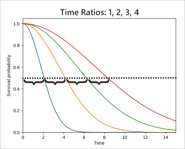
Using the leftmost blue curve as the baseline was an arbitrary choice. If the rightmost red curve was instead defined as the baseline being compared against, the time ratios would be 0.25, 0.5, 0.75, and 1 (from left to right). These time ratios less than 1 indicate that the red survival curve has the longest expected survival among the four curves.
The tool will estimate a time ratio for each explanatory variable, test the statistical significance of the time ratio, and display the result in the messages (see the Geoprocessing messages section below for more information). The interpretation of the time ratio depends on whether the explanatory variable is categorical or continuous, as they define their baselines differently. For categorical variables, one of the categories must be designated a reference category, and time ratios will be created for all other categories compared to the reference category. For example, if a categorical variable field has unique values A, B, and C, and category A is the reference category, time ratios will be calculated only for categories B and C. If the time ratio for category B is 2.2, it means that an observation in category B is estimated to live 2.2 times longer than an observation in category A, assuming all other attributes are equal (or, equivalently, that the survival curves for category B are stretched 2.2 times wider than survival curves for category A). The tool uses the first category sorted alphanumerically as the reference category, but you can reclassify the field values to change which category will be used as the reference category.
For continuous variables, the time ratio is the change in the lifespan for a one-unit increase in the explanatory variable. In this case, the comparison is between two observations that differ in the value of the explanatory variable by exactly 1 (with all other explanatory variables equal). For example, when estimating tree lifespans, if the trunk diameter in meters is an explanatory variable, the time ratio measures the increase (or decrease) in lifespan by increasing the tree diameter by 1 meter. If trees with larger trunk diameters tend to live longer, the time ratio will be greater than 1, and if they tend to live shorter, the time ratio will be less than 1. Because the time ratio is a multiplier, a two-unit increase in the explanatory variable will increase the lifespan by the time ratio squared; a three-unit increase of the explanatory will increase the lifespan by the time ratio cubed; and so on. This compounding nature of the time ratio for continuous explanatory variables can cause modeling difficulties (see the Best practices, limitations, and suggested workflow section below for more information and recommendations).
AFT model estimation
The AFT model uses a Weibull distribution to model the survival curve:

The scale parameter (λ) is estimated as a linear model of the explanatory variables (Xi) and estimated coefficients (βi). It is the scale parameter that controls the amount of stretching of the survival curve, as described in the previous section. Intuitively, the particular attributes of an observation will stretch (or contract) the survival curve for that observation, depending on whether its attributes are generally associated with longer or shorter lifespans.
The shape parameter (ρ) is shared by all observations and allows the survival curve to take various shapes within the same time range. The following image shows different shapes for Weibull distributions with the same scale parameter:
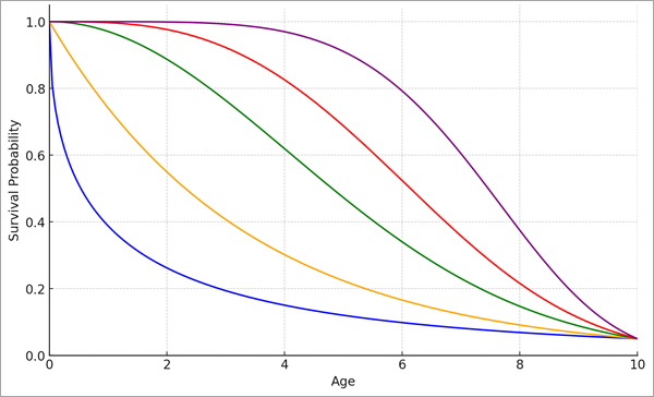
The shape parameter is sometimes called the acceleration parameter because it relates to whether the survival curve accelerates or decelerates. The acceleration is measured by the hazard function, which is defined as the likelihood of the event happening at a particular time, assuming that the event has not occurred before that time. For example, if older bridges are more likely to need repair in the near future than younger bridges, the hazard function increases over time (in other words, older bridges have higher hazards than younger bridges), so the survival curve accelerates over time. Conversely, if older bridges are less likely to need repair in the near future than younger bridges, the hazard rate decreases and the survival curve decelerates. Shape parameter values greater than 1 indicate an accelerating survival curve, and values less than 1 indicate a decelerating survival. However, the model cannot estimate varying hazard rates, in which the survival curve both accelerates and decelerates at different times (for example, human lifespans have higher hazards for infants, then lower hazards for children and young adults, then higher hazards again for older adults).
All coefficients and the shape parameter are estimated using maximum likelihood and are displayed as messages by the tool.
Censored observations and prediction
The previous sections described how survival curves are estimated for every observation, whether or not the event has already occurred for the observation. For example, a survival curve can be created for a bridge that has already failed. In essence, this survival curve shows the expected lifetime of the bridge if it were constructed with the same attributes today. While this information can be useful, it is much more useful to create survival curves predicting the additional lifetimes of observations in which the event has not occurred (for example, predict how much longer an existing bridge will last until it needs repairs).
Observations in which the event has not yet occurred are called censored observations, and observations in which the event has occurred are called uncensored observations. This terminology comes from the fact that uncensored observations have complete information (their survival time is known), but censored observations only have partial information: the exact survival time is not known, but it is known to be longer than some amount of time (the current age of the observation). This is comparable to the idea that a document can be uncensored or censored: all information of the document may be available (an uncensored document) or parts may be redacted by a censor (a censored document).
For censored observations, the goal is to create a survival curve that estimates the additional time until the event, given its current age. This additional survival time curve can be constructed by conditioning on the amount of time the individual has already survived. Mathematically, the additional survival time curve, SAdd(T), is calculated as SAdd(T) = S(C+T)/S(C), for T additional time units after censoring time C.
The additional survival time curve can be visualized as a rescaling of the observation's survival curve after the censoring time. For example, the image below shows a survival curve for an observation that was censored at time 4. Based on its explanatory variables, there was approximately a 60 percent probability that the individual would live at least four time units (the y-axis value at the censoring time). However, because the individual is known to have survived at least four time units (the censoring time), the y-axis values rescale to start at 1 again (in other words, there is a 100 percent probability that the individual survived at least four time units). Similarly, the x-axis begins from 0 again to measure time going forward from the censoring time. In this example, the median survival time for an individual with these explanatory variables is approximately five time units (where the curve crosses 0.5 on the original y-axis), but if it is known that the individual has already survived four time units, the median additional survival time is approximately two time units (where the curve crosses 0.5 on the smaller rescaled y-axis) for a total lifespan of six time units. In other words, knowing that the individual has already survived for four time units increases the total median lifespan from approximately five time units to approximately six time units. The longer the observation survives before being censored, the longer it is expected to survive compared to its baseline survival curve.
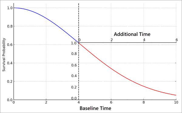
For censored observations, the survival curves showing the additional times to the event after censoring are displayed in the pop-up charts of the output features or table. For both censored and uncensored features, the individual survival curves are also displayed in the pop-up charts.
The age of the observation at the censoring time will usually be the current age of the observation, but it can also be the age when the individual was last observed, such as the most recent date of a bridge inspection. In that case, the additional survival time starts at the age of the observation when it was last observed.
Kaplan-Meier curve
Because each combination of explanatory variables results in a different survival curve, it can be difficult to quantify whether a particular observation is expected to have a longer or shorter lifespan than a typical observation. Some of the explanatory variables of the observation increase the lifespan, and others shorten it, but it is not clear whether, in total, they lengthen or shorten the lifespan of the observation. To provide a curve that can be used as a basis of comparison against individual survival curves, the tool calculates a Kaplan-Meier curve for the data.
The Kaplan-Meier curve is a nonparametric estimate of the survival function that ignores explanatory variables and estimates the proportion of observations that have not experienced the event over time. It does this by sequentially adjusting for event and censoring times using the following equation:

In the equation, Ei is the number of events that occurred at time ti, and Ni is the number of observations that had not experienced the event or been censored before time ti.
The curve visualizes as a step function that decreases each time the event occurs. The curve cannot extend past the time of the largest age field value, and the survival probability will never go below the percent of individuals that were censored. For example, in the Kaplan-Meier curve below, the largest value of the age field was approximately 3500 (the maximum value of the x-axis), and slightly more than 40 percent of the observations were censored (the smallest value of the curve is slightly larger than 0.4).
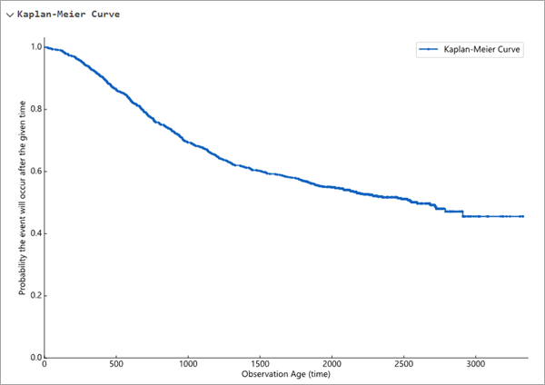
The Kaplan-Meier curve for the data is displayed in a collapsible section of the geoprocessing messages. It is also displayed in the pop-up charts of the output features or table so that it can be directly compared to the survival curves of individual observations (see the next section for more information).
Tool outputs
The tool returns a variety of outputs to investigate the results. The outputs include an output feature class or table, geoprocessing messages, pop-up charts, and a histogram.
Output features or table
For feature input, the output feature layer will draw based on the median additional time to the event. Censored features are drawn in shades of red and pink with deeper shades indicating that the event is predicted to occur sooner. Uncensored features are drawn in light gray and are configured to draw underneath the censored features if their symbols overlap.
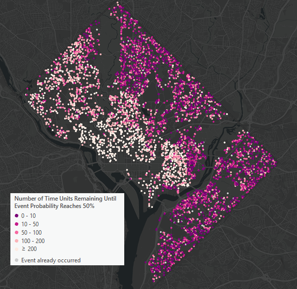
For both table and feature inputs, the output will contain copies of all input fields, along with various quantiles of the additional time to the event. The fields will contain the 5th, 10th, 25th, median (50th), 75th, 90th, and 95th percentiles of the additional time to the event. You can use these values to create ranges for when the event is likely to occur, for example, by using the 5th and 95th percentiles to construct a 90 percent confidence interval. For uncensored features, all quantile field values will contain null values because predicting when the event will occur is not necessary if the event has already occurred.
Pop-up charts
If the Enable Survival Curve Pop-ups parameter is checked, the output features or table will also contain a field of pop-up charts for each observation. For features, you can access the pop-up charts by clicking the feature in the map using the Explore tool. For tables, the pop-up charts can be accessed by right-clicking the row of the record in the attribute table.
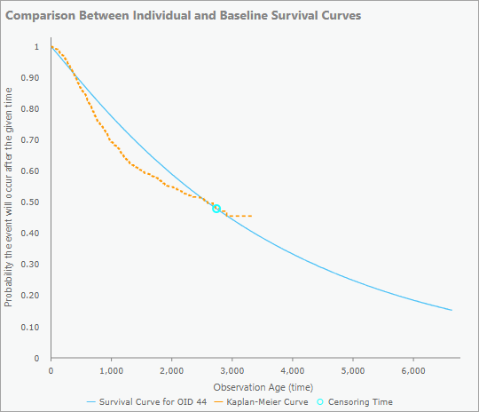
For uncensored observations, the pop-up chart will show the survival curve for the feature (blue curve) and a blue dot indicating the event time. This allows you to see whether the observation experienced the event early or late in its predicted lifespan. Observations with events much earlier or later than expected by the model may warrant further investigation. The Kaplan-Meier curve (orange curve) is also included in the pop-up chart as a basis for comparison. This allows you to see whether the observation was expected to survive longer or shorter than a typical observation. For example, in the image below, the survival curve is lower and to the left of the Kaplan-Meier curve, meaning that the event was expected to occur earlier than for most other observations. The blue dot is also in the middle of the survival curve, meaning that the event occurred approximately when the model predicted it would, based on its explanatory variables.

Note:
The x-axis of the pop-up charts will extend until the survival curve reaches 0.1 (a cutoff value is needed because survival curves never reach zero). However, because the Kaplan-Meier curve cannot extend past the largest value of the age field, it will often end before the survival curve reaches 0.1. To ensure that the Kaplan-Meier curve can be seen, the x-axis will never extend to more than twice the length of the Kaplan-Meier curve, even if the survival curve still does not reach 0.1.
For censored features, the pop-up charts will also contain the survival curve and Kaplan-Meier curve for the observation, but the censoring time will be indicated by a blue circle rather than a dot.
For censored features only, the pop-up charts will also contain a chart of the additional time to the event after censoring. The median additional time is drawn as dashed horizontal and vertical lines to identify the time when the model predicts a 50 percent probability that the event will have occurred. The x-axis will extend until the curve reaches 0.4 to ensure that the median is always shown.
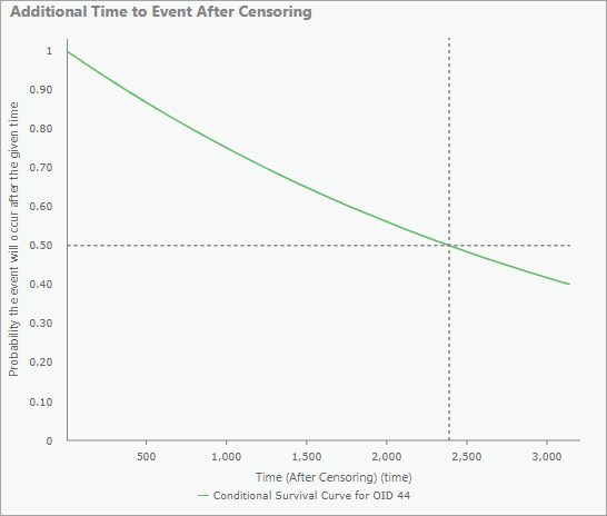
You can hover over any of the pop-up charts to see particular values of the curves.
Geoprocessing messages
The geoprocessing messages contain various sections summarizing the effects of the explanatory variables and diagnostics related to how well the model fits the data.
Continuous explanatory variables
The first section of the messages contains a table summarizing the effects of the continuous explanatory variables. For each variable, the table displays the time ratio, the coefficient and its standard error (from the Weibull distribution scale parameter), the z-score and p-value testing the statistical significance of the coefficient, and the lower and upper bounds for a 95 percent confidence interval of the time ratio.
A row for the intercept term is included at the end, but the raw values typically do not have a meaningful interpretation. Instead, the purpose of the intercept is to scale the survival curves to the time unit of the age field. For example, if you converted the age field values from hours to days, all time ratios would remain the same, but the time ratio of the intercept would be divided by 24 (the conversion from hours to days). This is why the unit of the age field does not need to be specified in the tool and will give equivalent results regardless of the unit.

Note:
For each variable, the coefficient and its standard error are directly estimated by the AFT model and tested for statistical significance using a z-test. The time ratio is then calculated from the coefficient by taking its exponential: exp(coefficent). Time ratios are usually preferred to coefficients because time ratios are interpreted relative to the raw survival time, whereas the coefficients are interpreted relative to the logarithm of the survival time. The upper and lower confidence bounds are calculated by creating a confidence interval for the coefficient and calculating the exponential of the endpoints.
Categorical explanatory variables
The second section of the messages contains tables summarizing the effects of the categorical explanatory variables. For each categorical variable, a table is displayed showing the effect of each of its categories. The reference category is displayed above the table, and all time ratios must be interpreted relative to this category. For example, in the image below, the categorical variable is the ward number, and the ward 1 is the reference category. Observations in ward 2 live 5.345 times longer than observations in ward 1 (time ratio equal to 5.345), but observations in ward 8 live 23.6 percent shorter than observations in ward 1 (time ratio equal to 0.764). The p-values also indicate that wards 4, 5, and 7 are not significantly different than ward 1.

Note:
Each categorical variable is converted into a series of binary (0 or 1) variables, and these binary variables are used as continuous explanatory variables in the AFT model. For K categories, (K-1) binary variables are created, and each category receives a binary variable except the reference category (this process is called indicator encoding). One category must be excluded and used as a reference because including binary variables for all categories causes perfect collinearity, causing the model to be unable to estimate the coefficients and time ratios.
Weibull shape parameter
After the explanatory variable coefficient tables, the messages display a table summarizing the shape parameter of the Weibull distribution. The table also contains the z-score and p-value testing whether the shape parameter is statistically different than 1. Lower and upper bounds for a 95 percent confidence interval are also provided.

The shape parameter characterizes whether the survival curve is accelerating or decelerating. Values significantly greater than 1 indicate acceleration, meaning that the older the observation, the more likely it is to experience the event in the near future. Values significantly less than 1 indicate deceleration, meaning that younger observations are more likely to experience the event in the near future. Values not significantly different than 1 indicate that young and old observations are equally likely to experience the event in the near future. The model assumes that the survival curve constantly accelerates or decelerates but cannot switch between them.
Model summary statistics
The final section of the messages is a Model Summary section containing statistics related to the overall accuracy of the predictions and fit of the model. The section displays the following statistics:
- Concordance Index—A value between 0 and 1 indicating the probability that the model can correctly predict whether one individual will have a longer lifespan than another individual. Values close to 1 indicate that the model can nearly always predict which individual will experience the event first, and values near 0.5 indicate that the model is no better at predicting the ordering of the events than random chance. Values lower than 0.5 are rarely observed but would mean that the model predicts less accurately than random chance. The value is calculated as the proportion of paired individuals in which the model correctly predicted which of the two individuals experienced the event first. Censored features are not used in the calculation because their survival times are not known. In practice, the value is typically between 0.6 and 0.8.
- AIC—The Akaike information criterion (AIC) for the fit of the AFT model. This value is mostly informational but can be used in advanced workflows, for example, to construct nested likelihood ratio tests between different combinations of explanatory variables.
- P-value—The p-value for a global significance test of the explanatory variables. The value indicates whether the explanatory variables together significantly improve the model's predictions. If this value is not statistically significant (typically a value greater than 0.05), the model does not perform significantly better than providing no explanatory variables at all. The value is determined using a likelihood ratio test.
Deviance residual histogram
The output feature layer also includes a histogram of the deviance residuals of the observations. Deviance residuals are conceptually similar to residuals in other regression models in that they quantify whether an observation had a longer or shorter lifespan than was predicted by the model. Positive deviance residuals mean that the individual had a longer lifespan than was predicted, and negative deviance residuals mean that the individual had a shorter lifespan (note that some sources define the signs, positive or negative, the opposite way). If the model fits well, the average of the deviance residuals should be close to zero.
For uncensored observations, some will have longer or shorter lifespans than the model predicts, so their deviance residuals can be both positive and negative. However, deviance residuals for censored observations will always be positive. For this reason, the histogram is split by the event indicator field, showing separate histograms for censored and uncensored observations.
Deviance residuals are most useful for investigating outliers in the results, and extreme values in both histograms indicate different things. For uncensored observations, extreme negative values indicate that the observation experienced the event much earlier than was predicted by the model, and extreme positive values indicate that it experienced the event much later. Values larger than three in either direction likely indicate outliers or anomalous observations that could warrant further investigation or removal from the dataset. For censored observations, the values are less meaningful, but they generally measure how far along the observation was in its lifespan before it was censored. Values on the far left (those close to zero) indicate the observation was censored very early in its lifespan, and values on the far right indicate that it was censored very late in its lifespan (possibly already living longer than the model predicts, even before it was censored).

Deviance residuals are calculated with the following equation:

In the equation, S-hati(ti) is the estimated survival probability for the observation at the time of the event (or at the time it was censored) and δi is the event indicator.
Note:
Deviance residuals for censored observations are always positive because if an individual has already survived any amount of time, it is predicted to have a longer total lifespan than its baseline survival curve predicts (see the image in the Censored observations and prediction section above to understand why this is the case). This process ensures that the overall mean of the deviance residuals (censored and uncensored) is equal to zero for properly specified models.
Best practices, limitations, and suggested workflow
The tool comes with a number of limitations and challenges that may be encountered. The following are general recommendations and best practices when using the tool:
Predicting when an event will happen in the future is an inherently difficult task, so you are encouraged to keep realistic expectations. The tool can only extract information from the explanatory variables that you provide, but complex phenomena like infrastructure breakdown involve numerous factors that are often highly local and specific to each individual. In practice, you should usually treat the predicted times to the event as general indications of when the event might occur, rather than highly specific predictions of particular dates. You should also be particularly cautious and skeptical when extrapolating to times beyond the largest event time of the input data. Though often imprecise, the results of time-to-event analysis can still be very useful for providing general estimates of future costs or for prioritization and allocation of resources to observations most likely to next experience the event.
Time-to-event models are not inherently spatial, but incorporating spatial information may improve the model by accounting for geographic patterns. Consider adding spatial explanatory variables such as geographic regions as categorical explanatory variables or distances to key features as continuous explanatory variables. For example, in modeling urban tree mortality, distance to the nearest building could be important due to reduced sunlight from building shadows.
- The model assumes that the event will occur for every observation after some amount of time, but there are some cases when this is not true. For example, when predicting time to re-arrest, some individuals will never be re-arrested, but the model will still predict a survival curve for them. In practice, if the predicted additional time to survival for an observation is very large, it can mean that the event is likely to never occur.
- For continuous explanatory variables, the time ratios are the multiplicative change in the survival curve for a one-unit increase in the explanatory variable. However, for some variables, a one-unit change is miniscule and results in time ratios very close to 1 even for highly significant and important explanatory variables. For example, when predicting when roofs will need repair, the size of the building in square meters could be used as an explanatory variable. However, even if the size of the building is highly important, an increase in only a single square meter will have only a small effect on the survival curve. If one of your explanatory variables is highly significant (high z-score and low p-value) but has a printed time ratio equal to 1.000 or very close to it, consider dividing the values of the field by a large constant value. For example, dividing the square meters variable by 100 will produce identical survival curves and significance results, but the time ratio will now be interpreted as the change for a 100-square-meter increase in the building size, which may produce a more interpretable time ratio. Multiplying or dividing any of the explanatory variables (or the age field) by a constant value will produce equivalent survival curves, so you are encouraged to rescale the values if it helps with interpretation of the results.
- Because the time ratio is multiplicative, large values (compared to the values of the rest of the data) of any continuous explanatory variable can cause instability and unreasonably long or short survival curves. The time ratio represents the change for a one-unit increase in the explanatory variable, and this compounds exponentially. For example, a five-unit increase in the explanatory variable stretches the survival curve by the time ratio to the fifth power. For large values of the explanatory variable, these exponents can become very large and produce unstable survival curves. Outliers will be especially problematic, but even large values that are not outliers can still produce unstable survival curves. In these cases, a potential solution is to apply a logarithmic transformation to the explanatory variable. This will make the time ratio for the explanatory variable more difficult to interpret (it is now the stretching of the survival curve for a one-unit increase in the logarithm of the explanatory variable), but converting the explanatory variable to a logarithmic scale often counteracts the compounding effect of the time ratio and produces more reasonable survival curves.
While the estimation of the model parameters uses both censored and uncensored observations, uncensored observations provide the most information because their exact survival time is known. In general, it is recommended to have at least 10 uncensored observations per explanatory variable. However, categorical variables should be counted as multiple variables. A categorical variable with two categories counts as one variable; three categories counts as two variables; four categories counts as three variables; and so on. Additionally, every category should have several uncensored observations to best estimate the effect of all categories of the categorical variable.
- In some cases, it may be difficult to define the starting point of an observation's lifespan. For example, bridges undergo periodic repair and maintenance, so when predicting the time to next required repairs, the start date could be the date the bridge was originally constructed or the date the bridge last required repairs. In this case, you will need to decide whether a repaired bridge is considered equivalent to a new bridge. If you decide that repaired bridges are equivalent to new bridges, a single bridge could be included in the data multiple times to help build the model (once for each time repairs were required). However, if you decide that a repaired bridge is not equivalent to a new bridge, you could try using the number of previous times the bridge has required repairs as an explanatory variable.
While there is no perfect workflow for time-to-event analysis, the following is a general template for building and evaluating a model:
- Explore the input data, and decide which explanatory variables you will use. Choose explanatory variables that you know or expect to be related to the survival time, and explore them with charts. Scatter plots of explanatory variables versus the survival time will be particularly useful in determining which variables are related to the survival time (unfortunately, only uncensored observations can be used for this). Pay particular attention to any outliers in the continuous explanatory variables, and consider removing them or applying a logarithmic transformation. For categorical variables, ensure there are several uncensored observations for every category, and possibly merge or remove any categories with small numbers of uncensored observations.
- Depending on how the data is represented, a substantial amount of data engineering may be required to create the age and event indicator fields. For example, you may need to convert start and end date fields to age values (using the DateDiff Arcade expression in the Calculate Field tool will be useful for this), or reclassify a text field to a binary event indicator field.
- After running the tool and reviewing any warnings or errors, you should check the overall accuracy of the model and look for signs of poor fit or model misspecification. Review the histogram of deviance residuals, and pay particular attention to extreme residual values (positive or negative) in the uncensored observations. Assess the p-value and concordance index in the Model Summary section of the messages, and if the p-value is not significant (which will rarely be the case), you should attempt to find explanatory variables that better estimate the survival times. You should also assess whether the concordance index is acceptably large, keeping realistic expectations.
- If the overall model is sufficiently accurate, you should next review the coefficient tables in the messages to learn which explanatory variables impacted the survival times and the degree of their effect. Consider removing any explanatory variables that are not statistically significant.
- For features, next explore the output feature layer in a map and look for spatial patterns. Do some areas have longer survival times than others?
- Finally, explore the pop-up charts and attribute table of individual observations of interest to see their estimated survival curves.
References
The following resources were used to implement the tool:
- Collett, David. 2023. "Modelling survival data in medical research." Chapman and Hall/CRC. https://doi.org/10.1201/9781003282525.
- Davidson-Pilon, Cameron. 2019. "lifelines: survival analysis in Python." Journal of Open Source Software. 4(40), 1317, https://doi.org/10.21105/joss.01317.
- Klein, John P. and Melvin L. Moeschberger. 2003. "Survival Analysis: Techniques for Censored and Truncated Data." Springer Science & Business Media. ISBN 0-387-95399-X.
