Geostatistical Analyst のライセンスで利用可能。
Semivariogram/Covariance modeling is a key step between spatial description and spatial prediction. The main application of geostatistics is the prediction of data values at unsampled locations.
The empirical semivariogram and covariance provide information on the spatial autocorrelation of datasets. However, they do not provide information for all possible directions and distances. For this reason, and to ensure that kriging predictions have positive kriging variances, it is necessary to fit a model (in other words, a continuous function or curve) to the empirical semivariogram/covariance.
Learn about the relationship between semivariograms and covariance
Different views of the empirical semivariogram/covariance values
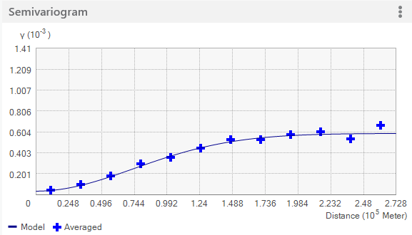
The Geostatistical wizard provides three different views of the empirical semivariogram values. You can use one, two, or all three of them to aid you in fitting a model to the data. The default view shows binned and averaged empirical semivariogram/covariance values. The controls for the visualization options described below can be found using the options button (the three vertical dots in the upper right corner of the figures).
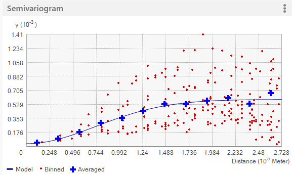
Binned values are shown as red dots and are generated by grouping (binning) empirical semivariogram/covariance points together using square cells that are one lag wide. Average points are shown as blue crosses and are generated by binning empirical semivariogram/covariance points that fall within angular sectors. Binned points show local variation in the semivariogram/covariance values, whereas average values show smooth semivariogram/covariance value variation. In many cases it is easier to fit a model to the averaged values, as they offer a less cluttered view of the spatial autocorrelation in the data and show smoother changes in the semivariogram values than the binned points.
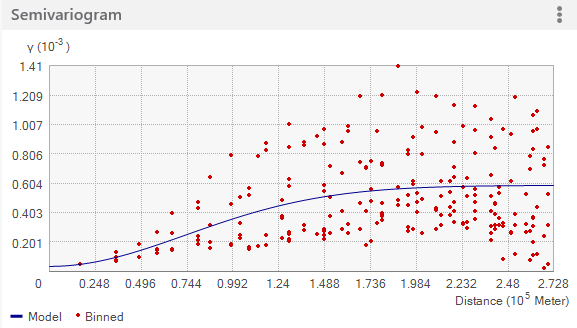
The following two figures show just the binned points (top) and just the averaged points (bottom):
Additionally, the green lines can be added to the plot by using the Show all lines option. The lines are local polynomials fitted to the binned empirical semivariogram/covariance values. The following figure shows a typical example of these lines.
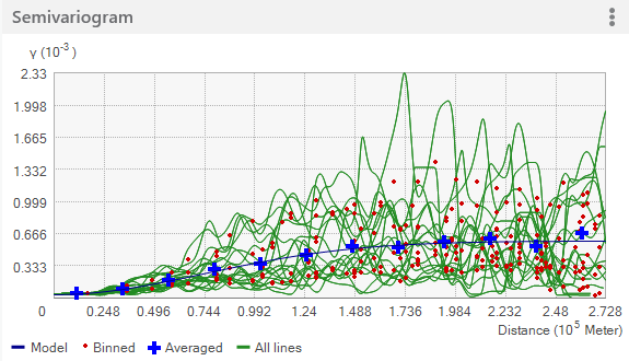
The semivariogram/covariance model you fit to the empirical data should do the following:
- Pass through the center of the cloud of binned values (red dots).
- Pass as closely as possible to the averaged values (blue crosses).
- Pass as closely as possible through the middle of the local polynomials (green lines).
Keep in mind that your knowledge of the phenomenon may dictate the shape of the model as well as its nugget, range, and partial sill and anisotropy values, even if the model does not appear to fit the empirical data too well (recall that the empirical data is just a sample of the real phenomenon you want to model and may not be fully representative of all of its spatial and statistical aspects).
Different types of semivariogram/covariance models
Geostatistical Analyst provides the following semivariogram/covariance functions to model the empirical semivariogram:
- Circular
- Spherical
- Tetraspherical
- Pentaspherical
- Exponential
- Gaussian
- Rational Quadratic
- Hole Effect
- K-Bessel
- J-Bessel
- Stable
The selected model influences the prediction of the unknown values, particularly when the shape of the curve near the origin differs significantly. The steeper the curve near the origin, the more influence the closest neighbors will have on the prediction.
As a result, the output surface will be less smooth. Each model is designed to fit different types of phenomena more accurately.
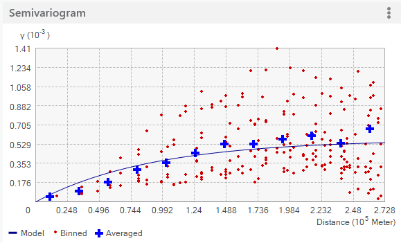
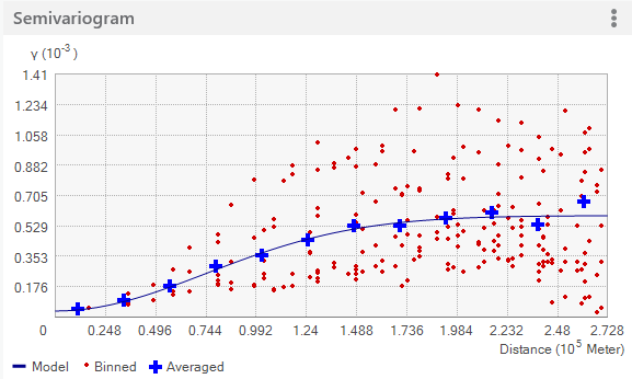
The diagrams below show two common models and identify how the functions differ. The first figure shows an exponential semivariogram, and the second graphic shows a Gaussian semivariogram:
