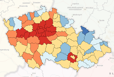
Graduated color symbology is used to show a quantitative difference between mapped features by varying the color of symbols. Data is classified into ranges that are each assigned a different color from a color scheme to represent the range. For instance, if your classification scheme has five classes, five different symbol colors are assigned. The size of the symbols stays the same. Maps that vary in color this way are usually called choropleth maps. Typically, you choose a continuous color scheme to apply different shades of the same color so that lighter shades match lower data values and darker shades match higher data values.
Symbol color is an effective way to represent differences in magnitude of a phenomenon because you can distinguish variations in color if there are relatively few classes. A range of seven colors is the approximate upper limit of colors that can be clearly distinguished on a map. Avoid using too many classes, especially if you are using light colors. Although symbol color is applied from a color scheme, you can modify the color of each symbol class. This means you can design a custom set of colors that have sufficient variation to make them distinguishable from one another.
When classifying data, your data may vary around a specific value that is important to maintain, such as a median value or any other significant threshold. For instance, data showing positive and negative change may vary around a value of 0. Rather than use a continuous color scheme with a midrange color applied to the values near 0, you want to clearly highlight that 0 is an inflection point in the data distribution. You can do this by adding a critical break to that symbol class and then applying a diverging color scheme. This forces the upper end of one class and the lower end of the next class to use the critical break value.

Graduated color symbology can be based on an attribute field in the dataset, or you can write an Arcade expression to generate numeric values on which to symbolize.
The Primary symbology tab  has three subtabs to establish graduated color symbology:
- The Classes tab is where you manage symbols, manually assign values to classes, create descriptive labels, and group the symbol classes.
- The Histogram tab is where you view and edit the data ranges of the symbol classes. See Histograms for more information.
- The Scales tab is where you specify the scale ranges in which each symbol class draws.
Draw a layer with graduated color symbology
To draw a layer with graduated color symbology, follow these steps:
- Select a feature layer in the Contents pane.
- On the ribbon, on the Feature Layer tab, in the Drawing group, click Symbology and click Graduated Colors to open the Symbology pane.
- In the Symbology pane, on the Primary symbology tab
 , choose the numeric field for the data to be mapped.
 - Optionally, click the expression button
 to open the Expression Builder dialog box. Write an expression and click Verify
  to validate it.
Note that although an expression is valid, it may not return a valid numeric value. You can use the filter button
 on the Expression Builder dialog box to show only numeric fields to help prevent this.
 - To normalize the data, choose a field from the Normalization menu. Choose percentage of total to divide the data value to create ratios, or choose log to symbolize on the logarithm of each value.
This can be an effective way to generate a smaller range of values if the dataset includes significant outliers. Normalization is available only when the graduated color symbology is based on a field. If it is symbolized on an expression, the Normalization field is disabled.
- Classify the data using an appropriate classification method and number of classes.
- Choose a color scheme.
The classification method and number of classes in the layer dictate which color schemes from core styles appear in the list. For example, if you classify your data by standard deviation, diverging color schemes are available. If you show five classes, only continuous color schemes and color schemes with five classes are shown. Color schemes stored in your Favorites style or custom styles always appear in this list, regardless of their type or number of colors.
Note:
The colors in the color scheme are applied to all symbol classes by default. To apply the color scheme to a subset of symbol classes only, select those classes by highlighting them on the table on the Classes tab in the Symbology pane. (Press Shift or Ctrl while clicking in the Upper value or Label columns to select symbol classes.) With symbol class rows selected, choose a color scheme from the Color scheme drop-down list at the top of the Symbology pane.
Click the Clear Selection button
 to unselect symbol classes if necessary.
Set the color scheme target
If you are symbolizing polygons, click the Color scheme options button  to choose the target for the color scheme. You can apply the colors to the polygon fills, outlines, or both.
When you change the color scheme target, the other symbol layers of the polygons symbolizing each symbol class are not updated. For example, when you set the color scheme target to Apply to outline, the fill symbol layers are not updated and setting it to Apply to fill does not alter the outlines of the polygons. This is to ensure that customized symbology is not lost. Symbol layers that are color locked are not updated by changes to the color scheme, regardless of the color scheme target setting.
To update all symbol layers to match the color scheme target setting, click the More drop-down menu and click Regenerate all symbols.
| Color scheme target | Result | Result after regenerating symbols |
|---|---|---|
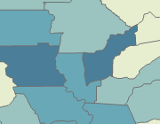
| Apply to fill | The color scheme is applied to the fills (fill symbol layers) of the polygon symbols. | The color scheme is applied to the fills of the polygon symbols. Polygon outlines (stroke symbol layers) are solid gray lines. |
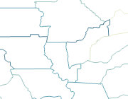
| Apply to outline | The color scheme is applied to the outlines (stroke symbol layers) of the polygon symbols. | The color scheme is applied to the outlines of the polygons. Polygon fills are fully transparent. |
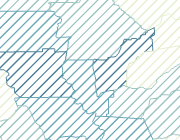
| Apply to fill and outline | The color scheme is applied to the fills and outlines (fill symbol layers and stroke symbol layers) of the polygon symbols. | The color scheme is applied to the outlines of the polygons. The color scheme is applied to the fills of the polygons as hatches. |
Modify graduated colors symbology
The Primary symbology tab of the Symbology pane  includes the Classes, Histogram, and the Scales subtabs, each of which also have a More drop-down menu that contains additional commands.
The Classes tab includes an interactive table that lists the graduated colors classes with their corresponding symbols and headings, as defined by the symbology parameters in the upper portion of the pane.
In the graduated colors classes table, you can do the following:
| Task | Steps |
|---|---|
Change the symbol for a single class | Click a symbol in the Symbol column of the table to open the Format Symbol pane and modify the symbol or choose a different symbol. You can modify common properties of more than one symbol at a time. Highlight the symbol classes in the table, right-click and click Format symbol Click the back button |
Set the symbol's legend patch shape | Click the drop-down arrow next to the symbol and choose a shape to apply to the symbol class in the Contents pane and in legends in layouts. To change multiple legend patch shapes at a time, press Shift or Ctrl while clicking to select multiple symbols, right-click and click Update legend patch. |
Edit the label of a class | Right-click a non-symbol cell in the table and click Edit label |
Edit the upper value of a class | Right-click a non-symbol cell in the table, or double-click a cell in Upper value and type a new value. |
Edit the description of a symbol class. | First, ensure that the Description column is visible in the table. If not, from the More menu, check Show description to add the column to the table. To modify the description, right-click any non-symbol cell in the table, or double-click a cell in the Description column, to open the Edit Description dialog box to enter or modify the description of the symbol class. Symbol class descriptions are included in layout legends, depending on the legend settings. |
Add additional symbol classes | Use the Classes drop-down menu at the top of the pane to control the number of symbol classes. If the classification method is set to Manual Interval, you add additional symbol classes manually within the table itself. Right-click a non-symbol cell in the table and click Insert break above |
Combine symbol classes | To combine two or more symbol classes, highlight the rows in the table, right-click, and click Combine breaks |
Set a critical break | To set a critical break around a central, important value, right-click the symbol class and click Set as critical break |
Remove a critical break | Right-click the symbol class with a critical break and click Remove critical break |
Remove symbol classes | Use the Classes drop-down menu at the top of the pane to control the number of symbol classes. To removed a symbol class, right-click a non-symbol cell in the table and click Remove |
From the More drop-down menu you can perform the following tasks:
| Task | Steps |
|---|---|
Show values that are out of range | Values can end up out of range in the classification scheme when they are added after the classification was established, when they fall within removed classes, or when they contain null values. You can show values that are out of range in the table and assign a symbol to them to show them on the map. Click the More menu and check Show values out of range to add an <out of range> symbol class. |
Show excluded values | To specify which features are to be excluded from classification, on the Advanced symbology options tab On the More menu, check Show excluded values to add an <excluded> symbol class. |
Show the feature count of each symbol class | Click the More menu and check Show count to add the Count column to the table. If excluded values or out of range values are not shown in the legend, their respective total counts are listed at the bottom of the Symbology pane. To update the count of features in each classification range (and values out of range), right-click the Count column in the table and choose Refresh count. |
Show statistics | Click the More menu and check Show count to add the Statistics section below the table. Statistics include the overall feature count, the minimum and maximum values of the data, and the mean and standard deviation of the values. |
Show class ranges using feature value | Click the More menu and check Use feature values in labels to use only values that are present in the field as boundaries in the symbol class labels. This can be help you identify significant gaps in the data. |
Refresh values | If the source data has changed or updated, click More, and click Refresh values to update the class ranges using the current settings at the top of the pane. |
Include a description of each symbol class. | Click the More menu and check Show description to add the Description column to the table. Double-click a cell in this column to edit or update the description on the Edit Description dialog box and click Update to apply the description. The description appears with its symbol class in layout legends, depending on the legend settings. |
Format all symbols | Click the More menu and click Format all symbols to modify the common properties of all the symbols in all the symbol classes. Verify the change to each symbol visually in the symbol preview. Click the back button |
Regenerate all symbols | Click the More menu and click Regenerate all symbols to regenerate all symbols to reset each symbol class to its default symbol based on current symbology parameters. You may want to do this to discard individual symbol edits and return all symbol class symbols to a default state. |
Reverse symbol order | Click the More menu and click Reverse symbol order. Reversing the symbol order retains the symbol class ranges but flips the order of the symbols assigned to each class, so that the symbol that was initially assigned to the lowest symbol class is now assigned to the highest, and vice versa. |
Reverse values | Click the More menu and click Reverse values. Reversing the values flips the order of the symbol classes, leaving the symbols themselves in the original order, so that the highest class is not at the top of the table, assigned to the symbol that was previously used with the lowest class, and vice versa. |
From the Advanced symbology options tab  , you can do the following:
Format labels | Expand the Format labels heading to change the rounding, alignment, and other formatting of the symbol class labels. See the Format numbers in legend labels topic for detailed instructions. |
Adjust the sample size | Expand Sample size to change the maximum sample size used to calculate the symbol class ranges and statistics. The default sample size is 10,000 records. Limiting the sample size can improve performance but may inadvertently omit important outliers in the dataset. Generally, the larger the dataset, the larger the sample size you should use. |
Exclude values | To exclude data values from the classification, expand Data exclusion to define the query. To visualize excluded values on a map, on the More menu, check Show excluded values to add an <excluded> symbol class with a unique symbol. |
Set up feature level masking | Expand the Feature level masking heading to set up masking per feature |
Override the default feature drawing order | To draw features in a different order—usually to avoid smaller symbols getting obscured by larger ones—expand the Feature drawing order heading. Choose one or more fields, and set a sorting method. See Set the feature drawing order for detailed instructions. |
Modify class breaks with a histogram
The histogram offers a visual tool for editing the classes and understanding how the data is represented by different classification methods. Access it by clicking the Histogram tab on the Primary symbology tab  .
.
- The gray bars of the histogram represent the distribution of the data. The value stops along the side show how the current classification method applies to the data distribution.
- To view the distribution and class breaks more easily, you can drag the expander bar above the histogram upward to make it larger in the pane.
Note:
Making dynamic edits to the histogram switches the classification method to Manual.
Vary graduated color symbology by transparency, rotation, or size
In addition to specifying the magnitude of features with graduated color symbology, you can also symbolize additional attributes by varying the transparency, rotation, and size of the graduated color symbols. These variations are sometimes called visual variables. While all of these visual variables can be applied simultaneously, be aware that too many variations make the layer difficult to interpret. It is recommended that you apply secondary visual variable symbology sparingly.
Learn more about symbolization concepts
- In the Symbology pane, click the Vary symbology by attribute tab
 .
. - Expand Transparency, Rotation, or Size.
In the case of polygon features, Outline width replaces Size, and Rotation is not available.


 to return to the
  , or double-click a cell in the
  or
or  to position the new symbol class.
  .
. . Choose a diverging color scheme to highlight the central value.
 .
. .
.