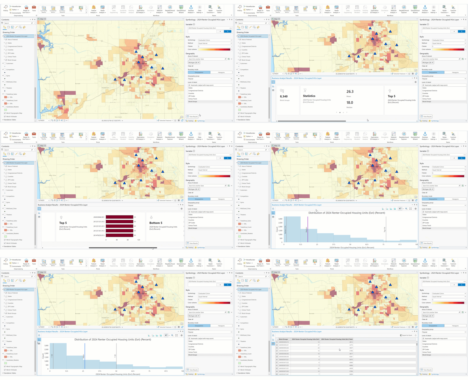
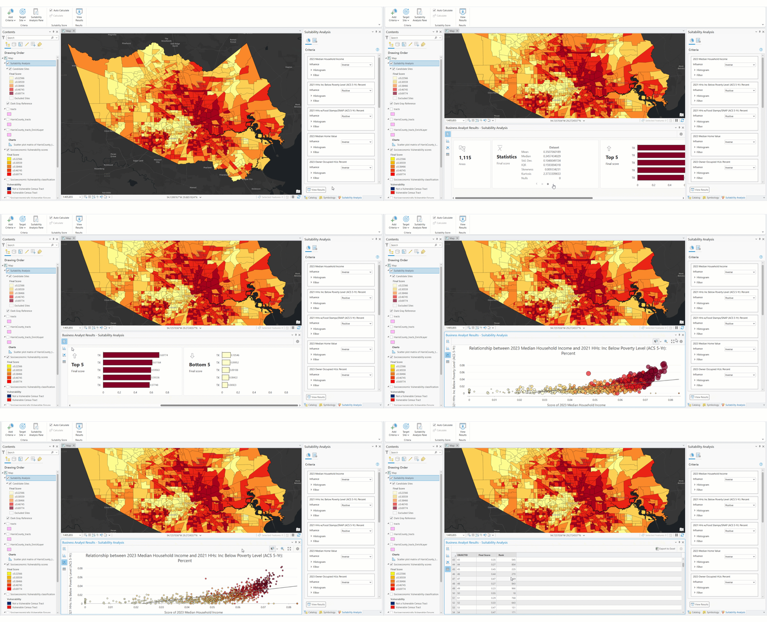
The ArcGIS Business Analyst Pro Results pane displays the results of analysis through data summaries, visualizations, and a table. The data visualizations and table are interactive. For instance, if you select a bar in the histogram or a cell in the table, its corresponding features are highlighted on the map.
You can access the Results pane within the following workflows:
Examples
The following scenarios provide examples of organizations using the Results pane in various workflows.
Color-coded layer example
A small-business owner of laundry and dry-cleaning facilities is interested in expanding into new markets. They start the expansion process by analyzing successful stores in existing markets, mapping their current facilities and creating a color-coded layer that shows the percentage of renter-occupied housing units around these locations. They notice that two stores are in areas with a relatively high percentage of renter-occupied housing units, which is indicated by red shading. They select these two stores for further exploration to understand how they perform in areas with high renter housing.

To create this example yourself, see the Expand a small business tutorial.
Suitability analysis example
A GIS analyst in the Atlanta metropolitan area is tasked with identifying socioeconomically vulnerable neighborhoods in Gwinnett County. To accomplish this goal, they'll use the suitability analysis workflow to show areas that should be prioritized for intervention based on income, housing stability, employment opportunities, and more. They enrich census tracts with relevant demographic information and use suitability analysis to calculate socioeconomic vulnerability scores for each tract. The results may shape policies and programs aimed at reducing disparities and fostering equity.

To create this example yourself, see the Prioritize intervention with suitability analysis tutorial.
Benchmark comparisons example
An insurance company sets up FEMA's National Risk Index data in ArcGIS Business Analyst Pro to assess localized physical climate risks, like floods, hurricanes, and wildfires. The company runs a benchmark comparison for all the counties in California to understand how region-specific risks may affect the business they insure and the downstream impact such risks will have.

To create this example yourself, see the Set up custom data for infographics tutorial.
Calculations
The information in the Results pane has a statistical methodological background. The statistical concepts used in each view of the Results pane are described below.
Summary view
The Summary view  provides an aggregate-level analysis of the workflow results.
| Calculation | Description | Workflows |
|---|---|---|
Aggregate-level data | Aggregate-level data is a summarization of data. It can be represented in the form of averages, percentages, or proportionality. |
|
Top 5/Bottom 5 | Top 5 and Bottom 5 represent the five highest and lowest ranking features. |
|
Statistics | The Statistics card contains two slides:
|
|
Box plot | Box plots allow you to visualize and compare the distribution and central tendency of numeric values through their quartiles. Quartiles are a method of splitting numeric values into four equal groups based on five key values: minimum, first quartile, median, third quartile, and maximum. Box plots use the percentile calculation to determine quartile values. For example, the first quartile is equal to the 25th percentile. For more information, see Box plot. |
|
Outliers | Outliers are values that are more than 1.5 times the interquartile range above the third quartile or below the first quartile of the selected field. |
|
Mean | The mean is the average value in a distribution, calculated as the sum of the values divided by the total count of values in the data. |
|
Median | The median is the middle value in a sorted list of values. If there is an even number of values, the median is the mean between the two middle values in the distribution. |
|
Standard deviation | The standard deviation is a measure of the spread of the distribution. It is calculated as the square root of variance, in which the variance is the average of the squared difference of each value from the mean of the attributes or variables. |
|
Interquartile range (IQR) | The IQR is the range between the first quartile and the third quartile values in the field. Quartiles divide the sorted list of values into four groups containing equal numbers of values. |
|
Skewness | Skewness measures the symmetry of the distribution. Skewness is zero (or close to zero) if the distribution is symmetrical on both sides, as seen in a normal distribution. Distributions with longer tails on the left have negative skewness, and distributions with longer tails on the right have positive skewness. |
|
Kurtosis | Kurtosis describes the heaviness of the tails of a distribution compared to the tails of a normal distribution, helping identify the frequency of extreme values. Distributions with kurtosis less than three have lighter tails and fewer extreme values than the normal distribution, and distributions with kurtosis greater than three have heavier tails and more extreme values than the normal distribution. |
|
Nulls | The total number of records containing null values for the selected variable. |
|
Histogram view
The Histogram view  provides an interactive histogram visualizing the variables or attributes used in the analysis layer. A histogram is a graphical representation, similar to a bar chart, that represents the distribution of the data.
| Statistic | Description | Workflows |
|---|---|---|
Median | The median is the middle value in a sorted list of values. If there is an even number of values, the median is the mean between the two middle values in the distribution. The median is indicated by a line on the histogram and is shown when using the Percentage and Outliers subset selection methods. |
|
Percentage | A value between 1 and 24 in increments of 1 that represents a percentage. In the histogram settings, Percentage can be used as a subset selection method. The data can be divided into subsets by a specified percent value. |
|
First Quartile (Q1) | The value of the first quartile in the data. The first quartile is the value of the 25th percentile: the upper limit of the lowest quarter of the data in ascending order. |
|
Third Quartile (Q3) | The value of the third quartile in the data. The third quartile is the value of the 75th percentile: the upper limit of the lowest three-quarters of the data in ascending order. |
|
Mean | The mean is the average value in a distribution, calculated as the sum of the values divided by the total count of values in the data. |
|
Standard deviation | The standard deviation is a measure of the spread of the distribution. It is calculated as the square root of variance, in which the variance is the average of the squared difference of each value from the mean of the attributes or variables. In the histogram settings, Standard deviation can be used as a subset selection method. The data can be divided into subsets by a specified value of standard deviations, from 0.5 to 5, in increments of 0.5. |
|
Outliers | Outliers are calculated using the interquartile range (IQR). Outliers are values that are 1.5 times the IQR above the third quartile and values that are 1.5 times the IQR below the first quartile.
In the histogram settings, Outliers can be used as a subset selection method. |
|
Scatterplot view
The Scatterplot view  provides a scatterplot or bubble chart visual representation of the data. Scatterplots and bubble charts plot points on x- and y-axes to represent the distribution of data. In a bubble chart, the size of the plotted point is proportional to the value of the data.
| Calculation | Description | Workflows |
|---|---|---|
Scatterplot | A scatterplot plots points on an x- and y-axis to represent the distribution of data. In a scatterplot, the size of each plotted point is standardized. |
|
Bubble chart | A bubble chart plots points on an x- and y-axis to represent the distribution of data. In a bubble chart, the size of the plotted point is proportional to the value of the data. |
|
X-axis | The x-axis in a chart is horizontal, or East-to-West oriented. |
|
Y-axis | The y-axis in a chart is vertical, or North-to-South oriented. |
|
Regression line | In statistics, a regression line is a straight line that is used in a data visualization (such as a scatterplot) to represent how variables correspond with each other. A regression line is calculated with a formula, in which y = mx + b. In this formula, the m variable represents the slope of the regression line, and the b variable represents the y-intercept. Data analysts use a regression line to understand the trends in the data and estimate or predict what a value could be. To measure how close data is to the regression line, use the R-squared (R2) value. |
|
Table view
The Table view  provides the results in a tabular and exportable format.
| Calculation | Description | Workflows |
|---|---|---|
Rank | In color-coded layers, a feature's rank for the selected variable value within the analysis or area of interest. In suitability analysis, a location's rank for the final score value. |
|
Final score | A site's final suitability score is calculated by adding the weighted scores for each of the variables used in the analysis. |
|
Benchmark | The feature value or measurement that all feature values are compared to. |
|
Above benchmark | When using the Above and below benchmark comparison method, this indicator identifies that a feature is above the benchmark value, and by how much. |
|
Below benchmark | When using the Above and below benchmark comparison method, this indicator identifies that a feature is below the benchmark value, and by how much. |
|
# of # | When using the Top and bottom comparison method, this indicator identifies the features at the top and bottom of the data distribution, as well as the total number of features. |
|
# | When using the High to low comparison method, this indicator ranks each feature for each variable and measurement. |
|
Resources
To learn more about the workflows that generate Results panes, see the following:


