Spatial data and attribute data are complementary. Spatial data represents various aspects of geography as layers on a map. Attribute data stores information about those layers as rows and columns in a table. Layers can be queried, symbolized, and analyzed by their attributes to uncover geographic patterns and relationships.
Overview
- This video was created with ArcGIS Pro 3.6.
In this tutorial, you will explore several ways of working with attributes. You'll click features in a map layer to see what is known about them. You'll work with an attribute table to display and format fields of interest. You'll use data engineering to summarize data and export statistics. Finally, you'll create a chart to represent information from an attribute table visually.
- Estimated time: 45 minutes
- Software requirements: ArcGIS Pro Basic
Note:
The quick-start tutorials are updated at each software release. For the best experience, use an online help version that matches your software version.
Open the project
Livestock farming is a historic staple of the New Zealand economy. Sheep, cattle, deer, and pigs are farmed on both the North and South Islands. Today, agriculture accounts for about 7 percent of the country's total gross domestic product. Dairy farming is the most important part of the agricultural sector. Beef cattle and sheep raised for meat and wool are also important. In this tutorial, you'll explore information about sheep and other livestock at the New Zealand regional level.
- Start ArcGIS Pro and sign in if necessary.
- Open a browse dialog box to search for the project in one of the following ways:
- On the start page, click Open another project
 .
. - In an open project, click the Project tab on the ribbon. In the list of side tabs, click Open. On the Open page, click Open another project
 .
.

- On the start page, click Open another project
- On the Open Project browse dialog box, in the navigation pane, under Portal
 , click ArcGIS Online
  .
.Note:
If you are signed in to ArcGIS Enterprise
 , you must set your active portal to ArcGIS Online to access the tutorial data. If you can't do this, you can download the data from a browser.
 - At the top of the dialog box, in the Search box, type Explore data v360 and press the Enter key.
- In the list of search results, click Explore data v360 to select the project package.
Note:
If there is more than one project package with this name, select the package with the Authoritative badge
 . In the Owner column, the owner name is ArcGISProTutorials. If you don't get any results, see No search results are returned.
 - Click OK.
The project opens with a map of New Zealand's regions labeled with their names.

Explore regions and their attributes
Each region has information about the numbers of sheep and cattle found there. You can access this information in various ways: through pop-ups on the map, the layer attribute table, and the Attributes pane.
- On the ribbon, click the View tab. In the Windows group, click Pane Sets
 and click Mapping
  .
.This ensures that the Contents and Catalog panes are open and that other panes are closed.
- On the ribbon, click the Map tab if necessary. In the Navigate group, make sure that the Explore tool
 is selected.
 - On the map, click any region.

The Pop-up pane displays attributes for the region. They include the region name, its area, and livestock counts for various years. These attributes are stored in a table associated with the Regions layer.
Learn more about pop-ups
- In the Pop-up pane, scroll down, if necessary, to see all the attributes.
The IMAGE_URL attribute stores a link to an online image. Later in the tutorial, you'll configure the pop-ups to display the images referenced by this attribute.
- Click another region on the map.
The pop-up updates with the attributes for the region you clicked.
- Close the Pop-up pane. In the Contents pane, click the Regions layer to select it.
On the ribbon, contextual tabs for working with the layer appear.
- Click the Data tab. In the Table group, click Attribute Table
 .
.
The Regions table opens. Each row, or record, in the table represents a region on the map. Each column, or field, represents an attribute.
Note:
Some regions have null values for certain attributes, but this does not impact the tutorial workflow.
- In the Regions table, click any row header (the numbered gray square at the start of a row) to select a record.
The record is highlighted in the table, and the corresponding region is selected on the map.
Tip:
If you can't see the whole map when the table is open, you can zoom out on the map or float the table view.
- In the row of tools at the top of the table, click Clear
 to deselect the record and the feature on the map.
 - On the ribbon, click the Map tab. In the Selection group, click the Select drop-down arrow and click Rectangle
 .
. - On the map, draw a box over a few features to select them. (A feature is selected if any part of the box intersects it.)
In the table, the corresponding records are selected.
- In the status bar at the bottom of the table view, click Show Selected Records
 to see only the selected records.
 - Click Show All Records
 to display all the records.
 - On the ribbon, on the Map tab, in the Selection group, click Attributes
 .
.The Attributes pane appears. In the Attributes pane, you can view and edit attribute values for selected features. The currently selected features are listed in the upper half of the pane.
- One by one, click the regions listed at the top of the Attributes pane.
The region you click flashes on the map, and its attributes are shown in the lower half of the pane.
- Press the Ctrl key and click a second region at the top of the Attributes pane.

The Attributes pane compares the values of the two selected regions. In this case, the two regions have different values for all of their attributes. If they shared an attribute value—for example, the same number of beef cattle in 2003—that value would be displayed instead of the (Different Values) text.
Tip:
You can use the Layers tab at the top of the pane to step through the features in a layer and view or edit their attributes.
- Close the Attributes pane.
- On the ribbon, on the Map tab, in the Selection group, click Clear
 to deselect the map features and table records.
Now that you know what information you have about the regions—and know how to access it in different ways—you can begin to ask specific questions. For example, you can ask which region in New Zealand had the most sheep in 2023.
- In the attribute table, locate the Sheep 2023 field. Right-click its field heading and click Sort Descending
 .
.The region with the most sheep is Canterbury with 4,527,228. Manawatū-Whanganui is close behind with 4,411,333 sheep.
Design fields
You'll turn off visibility for some fields that you don't need to see. You'll also change field aliases, which are descriptive substitutes for field names. Aliases can include spaces and other characters that are not allowed in field names. Finally, you'll apply formatting to numeric fields to make the numbers easier to read.
- If necessary, in the Contents pane, click the Regions layer to select it.
- On the ribbon, click the Data tab. In the Data Design group, click Fields
 .
.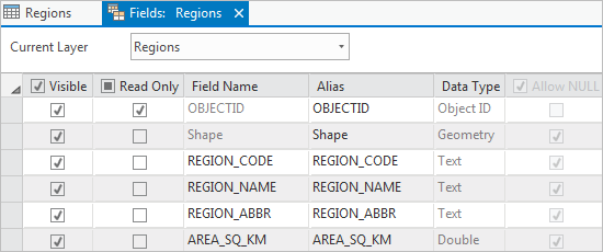
The Fields: Regions view opens, allowing you to work with the fields of the Regions table. In the fields view of a table, each row represents a field and each column represents a field property, such as the field name or data type.
- In the Visible column, uncheck the box in the column heading to turn off visibility for all fields in the table.
- Scroll down through the fields view. In the Visible column, check the boxes for the following fields to make them visible:
- REG_NAME
- AREA_SQ_KM
- BEEF_CATTLE_2023
- DAIRY_CATTLE_2023
- SHEEP_2023
Fields that are not visible do not display in the attribute table, the Attributes pane, or pop-ups, and are not available for table operations. You can make these hidden fields visible again at any time.
- In the Alias column, double-click the REG_NAME alias to make it editable. Replace it with Name and press the Enter key.
Caution:
Be sure to change the alias—the display name for the field—and not the field name itself. Both are editable.
- Double-click the AREA_SQ_KM alias to make it editable. Replace it with Area Square Km and press the Enter key.

The fields containing livestock attributes are already aliased.
- In the Number Format column, double-click the cell for the AREA_SQ_KM field. In the cell, click the Determine display formatting for numeric and date field types button that appears.

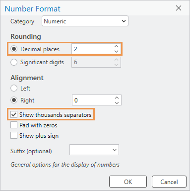
- On the Number Format dialog box, under Rounding, change Decimal places to 2. Check the Show thousands separators check box.
- Click OK.
The formatting will make the numbers easier to read.
- In the Number Format column, double-click the cell for the BEEF_CATTLE_2023 field. In the cell, click the Determine display formatting for numeric and date field types button.
- On the Number Format dialog box, check the Show thousands separators check box. Click OK.
- Change the number format for the following fields to show thousands separators:
- DAIRY_CATTLE_2023
- SHEEP_2023
- On the ribbon, confirm that the Fields tab is selected. In the Manage Edits group, click Save
 to save your field property changes.
 - Close the Fields: Regions view.
In the Regions table, five fields are now visible. The field headings show your aliases, and the numeric fields have thousands separators.
Tip:
If you don't see your changes in the table, click Refresh
 in the status bar at the bottom of the table view.
 - In the Regions table, right-click any row header (the numbered gray square at the start of the row) and click Pop-up
 .
.
Your field design changes are reflected in the pop-up. However, the changes have been saved only to the current ArcGIS Pro session. To make them permanent, you must save the project.
- Close the Pop-up pane.
- On the Quick Access Toolbar, click Save Project
 .
.
Query the table
Suppose you want to know which regions are major producers of both sheep and beef cattle. You can find out with an attribute query. An attribute query finds records in the table that meet a condition or set of conditions.
- On the ribbon, click the Map tab. In the Selection group, click Select By Attributes
 .
.The Select By Attributes window appears. The Input Rows parameter is correctly set to Regions. The Selection Type parameter is correctly set to New selection.
Note:
For convenience, some geoprocessing tools open in a floating window. These tools can also be opened in the Geoprocessing pane. In the Geoprocessing pane, this tool is called Select Layer By Attribute, but it is the same tool.
- In the clause builder, click the Where drop-down arrow and click Sheep 2023.
When you select a field, two more text boxes appear.
- Click the drop-down arrow next to is equal to and click is greater than or equal to. Click the empty text box and type 1000000 (1 million).

You can hover over a parameter to see its full text as a ScreenTip. This clause selects regions that have 1 million or more sheep.
- Click Add Clause
 to build a second clause.
A second clause is added with a logical operator to connect the clauses. The operator defaults to And, which is what you want in this case. Both clauses must be true for a region to be selected.
- In the second clause, click the drop-down arrow to select a field and click Beef Cattle 2023. Click the drop-down arrow next to is equal to and click is greater than or equal to. Click the empty text box and type 500000 (five hundred thousand).

- Click OK.
The operation runs and three regions—Canterbury, Manawatū-Whanganui, and Waikato—are selected in the table and on the map.

- On the ribbon, on the Map tab, in the Selection group, click Clear
 .
.
Get table statistics
The Regions table contains livestock values for each region but no totals or statistics. Suppose you want to know whether the North Island or the South Island has more sheep. To find out, you can select the features on each island and explore statistics in a Data Engineering view.
Learn more about data engineering
- On the map, make sure that you can see all the regions on the South Island.
- On the ribbon, on the Map tab, in the Selection group, click the Select drop-down arrow and click Polygon
 .
. - On the map, draw a polygon that encloses or intersects all the regions on the South Island and no regions on the North Island. Click to begin drawing the polygon, click to change direction, and double-click to finish.

Seven features should be selected on the map. The message Selected Features: 7 appears in the status bar. If you have a different number, clear the selection and try again. A small region that's easy to miss is Nelson, which lies between Tasman and Marlborough.
Tip:
You can press and hold the Shift key and draw a polygon to add features to the selection, or hold the Ctrl key and draw a polygon to remove features from the selection.
- Make the Regions table active. In the status bar at the bottom of the table, click Show Selected Records
 . Confirm that the seven selected records are Canterbury, Otago, Southland, Marlborough, Tasman, West Coast, and Nelson.
 - In the Contents pane, click the Regions layer to select it if necessary.
- On the ribbon, click the Data tab. In the Data Engineering group, click Data Engineering
 .
.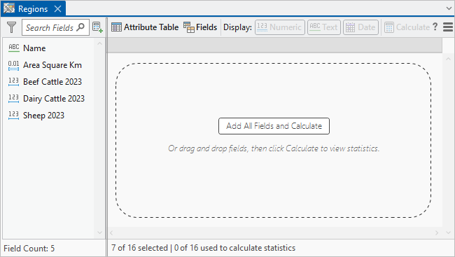
The Data Engineering view for the Regions layer appears. It is composed of a fields panel and a statistics panel.
- In the statistics panel, click Add All Fields and Calculate.
The fields from the Regions table are added to the statistics panel and calculated. In the status bar, you can see that the statistics are based on the seven selected records.
- In the statistics panel, right-click the Alias column heading and click Freeze/Unfreeze
 .
.The Alias column becomes the first column in the table and stays in view as you scroll.
- In the statistics panel, scroll to the right and locate the Sum column.
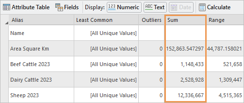
In the Sheep 2023 row, you can see there are 12,336,667 sheep.
- Make the Regions table active (not the Data Engineering view).
- In the row of tools at the top of the table, click Switch Selection
 .
.The nine North Island regions are selected on the map, and the corresponding table records are selected.
- Make the Data Engineering view active. In the row of tools at the top of the view, click Calculate
 to update the statistics.
The total number of sheep on the North Island is 12,001,999. The South Island has more sheep, but the difference is fairly small.
- On the Quick Access Toolbar, click Save Project
 .
.
Export statistics as tables
You'll save the North Island statistics by exporting the statistics in the Data Engineering view to a stand-alone table.
Tip:
You can also use the Summary Statistics geoprocessing tool to get statistics for a table.
- In the Data Engineering view, in the row of tools at the top of the view, click Statistics Panel Settings
 and click Export Statistics As Table
  .
. The Export Statistics geoprocessing tool appears in a floating window. This tool can also be opened in the Geoprocessing pane, where it is called Field Statistics To Table.
On the tool, most of the parameters have default settings. Under the input table, a toggle button indicates that only the nine selected features are used. The default output location—explore_data_v360.gdb—is the project's default geodatabase.
- Under Input Fields, hover over the Name field and click Remove
 to remove the field.
There are no useful statistics for the Name field.
- Under Output Tables, click the Field Types drop-down arrow and click Numeric.
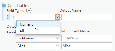
This ensures that all fields in the output table are formatted as numeric fields.
- In the Output Name text box, delete the default name and type North_Island_Statistics.
- Under Output Statistics, hover over the Field type statistic. Click Remove
 to remove the statistic from the table.
- Remove the following statistics in the same way. Be sure not to remove the Sum statistic.
- Mode
- Least common
- Outliers
- Interquartile range
- First quartile
- Third quartile
- Coefficient of variation
- Skewness
- Kurtosis
Tip:
If you remove a statistic accidentally, click Add Many
 at the top of the output statistics list. In the drop-down window, check the box for the statistic and click Add.
 - Hover over the Sum statistic. Click the row identifier button
 and drag the row to the position under the Alias statistic.
As you drag the row, its current position is indicated by a horizontal gray line.

- Click OK to run the tool.
When the tool completes, the North_Island_Statistics table is added to the Contents pane under Standalone Tables. A South_Island_Statistics table already exists.
- In the Contents pane, under Standalone Tables, right-click North_Island_Statistics and click Open
 .
.
- Optionally, format the fields in the North_Island_Statistics table to show thousands separators and fewer decimal places.
- In the Contents pane, right-click North_Island_Statistics, point to Data Design, and click Fields
 .
. - In the Number Format column, double-click the cell for the Sum field. In the cell, click the Determine display formatting for numeric and date field types button that appears.
- On the Number Format dialog box, check the Show thousands separators check box and click OK.
- Change the number formatting for the other fields to show thousands separators and change the number of decimal places to 2, as needed.
You can use the South_Island_Statistics table as an example.
- When you're finished, ensure that the Fields tab is selected on the ribbon. In the Manage Edits group, click Save
 .
.
- In the Contents pane, right-click North_Island_Statistics, point to Data Design, and click Fields
- Close all open tables and table views, including the Data Engineering view.
- On the ribbon, click the Map tab if necessary. In the Selection group, click Clear
 .
. - In the Navigate group, click Bookmarks
 and click New Zealand.
 - On the Quick Access Toolbar, click Save Project
 .
.
Chart sheep distribution by region
You've sorted, queried, and obtained statistics for the Regions attribute table. Now you'll visualize the distribution of sheep with a chart.
- In the Contents pane, click the Regions layer to select it.
- On the ribbon, click the Data tab. In the Visualize group, click Create Chart
 and click Bar Chart
  .
.The Chart Properties pane appears. An empty chart view named Chart of Regions also appears. On the ribbon, the Chart contextual tab appears.
- At the top of the Chart Properties pane, confirm that the Data tab is selected. Click the Category or Date drop-down arrow and click Name.
In the chart view, the region names appear on the chart's x-axis. At the moment, the chart displays the number of region names per region (which is 1). You must choose the field values that you want to chart.
- In the Chart Properties pane, click the Aggregation drop-down arrow and click <none>.
- Under the Numeric field(s) heading, click Select
 and check the Sheep 2023 check box.
- Click Apply.
The chart's y-axis and data bars update to show the number of sheep in each region.
- At the bottom of the Chart Properties pane, under Sort, click the drop-down arrow and click Y-axis Descending
 .
. - At the top of the pane, click the General tab.
Tip:
If the pane isn't wide enough to show this tab, click Options
 and click the tab name in the drop-down list.
 - In the Chart title box, change the title to New Zealand Sheep by Region in 2023 and press the Enter key.
The title is updated on the chart.
- In the X axis title box, change the title to Region Name and press the Enter key.
- In the Y axis title box, change the title to Number of Sheep and press the Enter key.
Some of the region name labels are cut off. This is because x-axis labels are limited to 11 characters by default.
- At the top of the Chart Properties pane, click the Axes tab. Under X-axis, change the Label character limit setting to 20 and press the Enter key.
- In the chart view, right-click the view tab and click Float.
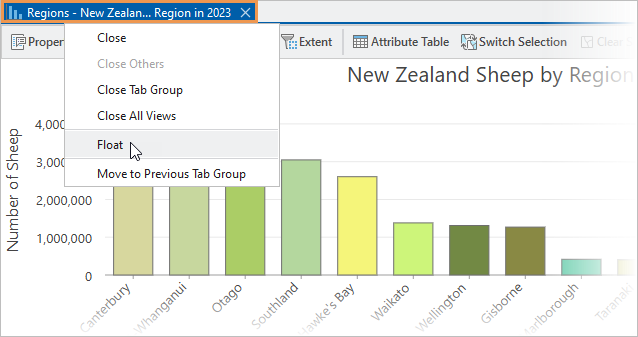
The chart view is undocked from the application window.
- Drag the chart to a convenient location. Resize it by dragging its corners or edges.

The regions are labeled on the x-axis and data values are labeled on the y-axis. The orientation of the region labels depends on the best fit. It is probably diagonal, as in the image above, but may be horizontal or vertical. The number of data values you see depends on the height of the chart.
Tip:
You can filter the chart to see fewer regions. To filter by selection, select features on the map or records in the table. In the chart view, click Filter By Selection
 . To filter by extent, zoom the map to your area of interest. In the chart view, click Filter By Extent
  . You can use selection and extent filters together. To remove a filter, click the selected filter button in the chart view.
 - Hover over a bar on the chart.
A ScreenTip displays the region name and the number of sheep in the region.
Tip:
To label the bars with their values, click the Data tab in the Chart Properties pane. Under Data Labels, check the Label bars check box.
- Drag a box on the chart that intersects the five tallest bars.
The bars are selected on the chart. The corresponding map features are also selected. Three of the five regions with the most sheep are on the South Island and two are on the North Island.
- In the row of tools at the top of the chart view, click Clear Selection
 .
. - In the Chart Properties pane, click the Format tab. Click the Text elements tab
 under it. In the list of text elements, click X-Axis Labels.
 - At the bottom of the pane, click the Color drop-down arrow and click Fir Green.

On the chart, the x-axis labels update with the new color.
- Click Y-Axis Labels and make them Fir Green also.
- Close the chart view and close the Chart Properties pane.
Note:
To reopen the chart, expand the Regions layer in the Contents pane. Under Charts, right-click the chart name and click Open
 .
. - On the Quick Access Toolbar, click Save Project
 .
.
Configure pop-ups
You can configure pop-ups with text, charts, images, and other elements. You'll add a bar chart that compares the number of beef cattle, dairy cattle, and sheep in each region. Recall that the Regions attribute table has an IMAGE_URL attribute with links to images. You'll add a unique image to the pop-up for each region.
- In the Contents pane, right-click the Regions layer and click Configure Pop-ups
 .
.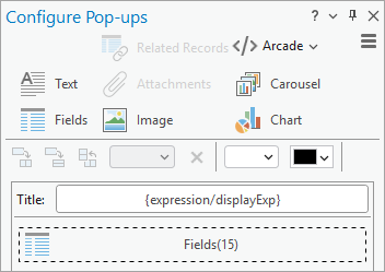
The Configure Pop-ups pane appears. It consists of the following sections:
- Commands to add elements to a pop-up
- Tools to arrange elements
- Current pop-up elements (by default, these include a title and a fields element)
- Buttons to disable pop-ups, add expressions, format fields, and reset the configuration.
- On the ribbon, click the Map tab. In the Navigate group, click Explore
 .
. - On the map, click a region to open its pop-up.

The upper part of the pop-up is a tree view that lists the identified features (in this case, there is only one). The lower part shows the currently configured pop-up elements: the title—made up of the layer name followed by the region name—and the five visible fields of the attribute table.
Tip:
To identify multiple features in a pop-up, you can hold the Ctrl key and drag a box over two or more map features. You can also click the drop-down arrow on the Explore tool
 and choose a setting that identifies features in multiple layers.
 - Close the pop-up.
- At the top of the Configure Pop-ups pane, click Chart
 to add a chart to the list of elements.
 - Hover over the Chart element and click Edit pop-up element
 .
.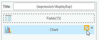
The pane shows options for working with charts.
- In the Title text box, change the default title to Livestock Comparison.
- In the Caption input box, delete the default caption.
- In the Fields list, check the boxes for the following fields:
- Beef Cattle 2023
- Dairy Cattle 2023
- Sheep 2023

- At the top of the Configure Pop-ups pane, click Back
 .
. - At the top of the pane, click Image
 to add an image to the list of elements.
 - Hover over the Image element and click Edit pop-up element
 .
.The pane shows options for working with images.
- In the Title box, delete the default title.
- In the Caption box, delete the default caption.
- Click in the Source URL input box. At the top of the pane, click the Field drop-down arrow and click IMAGE URL {IMAGE_URL}.

Note:
The Field drop-down list shows both the alias, IMAGE_URL, and the name {IMAGE_URL} in curly brackets. In this case, the alias and the name are the same.
When you click a region on the map, the linked image in the corresponding table record is displayed in the pop-up. Since a different link is stored in each record, you'll see a different image for each region.
- In the Configure Pop-ups pane, click Back
 .
. - Click a region on the map to see its pop-up.

- Click some other regions to see their pop-ups.
You can hover over the data bars on the chart to see the exact numbers of beef cattle, dairy cattle, and sheep in each region. You can also hover over the x-axis values to see the full field names.
- Close the Pop-up pane and close the Configure Pop-ups pane.
- On the Quick Access Toolbar, click Save Project
 .
.
Now that you have worked with attributes in different ways, try the Author a map and Symbolize map layers tutorials to see how attributes are used in map authoring.
