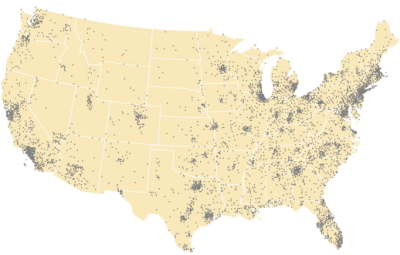
Dot density symbology is one way to represent quantities in polygons on a map. With dot density symbology, the data you symbolize is not classified. Instead, quantitative values for one or more fields are represented as a collection of point symbols (typically solid circles or dots) in each polygon. Each dot represents a constant number of things, people, or other quantifiable phenomena. The dots are equally sized, even when multiple fields are symbolized together in a layer.
To mimic a natural data distribution, a good approach is to symbolize a fine-grained polygon dataset, such as United States counties, with dot density symbology using a completely transparent polygon symbol. Then, overlay this layer over a coarser-grained categorization polygon layer, such as the states in the United States, symbolized with single-symbol symbology. This gives a better indication of where people actually live than if the dot density symbology were applied to the coarser states polygons instead. An example is shown below.

You cannot apply dot density to a layer in the 3D category of a scene, and you cannot drag a layer drawn with dot density symbology into the 3D layer category. For these reasons, you cannot specify real-world units for the symbol size of the dots.
Draw a layer with dot density symbology
To draw a polygon feature layer with dot density symbology, follow these steps:
- Select a feature layer in the Contents pane.
- On the Appearance tab, in the Drawing group, click Symbology and click Dot Density.
The Symbology pane appears.
- In the Symbology pane, on the Primary symbology tab
 , choose one or more numeric fields to be mapped.
 - Choose a color scheme that assigns dot colors for each of the fields displayed as part of the dot density layer. Optionally click the symbol for each field to modify.
Only the shape and color of the symbol you set in the Format Point Symbol pane are respected. The size is ignored. Dot size is dictated by the Dot Size property in the Symbology pane.
- Change Dot Size and Dot Value as necessary to achieve appropriate density and distribution for the data.
- Optionally click the Background symbol to modify the appearance of the polygon symbol used to display the underlying polygon features.
Tip:
To change the dot symbol directly, click it in the Contents pane, or right-click the symbol to change only its color. You can change the background symbol directly in the Contents pane in the same way.
Format the dots
When creating a dot density layer, you specify Dot Size and Dot Value; the dot value is the number of features each dot represents. You may need to try several combinations of size and value to show the best pattern. In general, choose values that ensure that the dots are not so close as to form solid areas that obscure the patterns, or so far apart as to make the variations in density hard to see. In most cases, you'll only map one field using a dot density map. In certain cases, you may want to compare distributions of different types and may choose to map two or three fields.
Typically dot density maps use small solid circular dots. This is because the point of the visualization is to see density and distributions. You can choose a different shape—any supported point symbol—but you may compromise the map's legibility and understandability, which is based on the density and distribution of the dots. Make sure you have a good reason for selecting something other than circles.
Unlike other symbology methods, the size of the symbols in dot density symbology is set by the dot density symbology method using the Dot Size property. You can customize the color and shape of the dot, but the size you set in the Format Point Symbol pane will be ignored and overridden by the Dot Size property in the Symbology pane for the dot density symbol method.
The symbology is drawn as point symbols distributed within polygon features. The polygon remains the feature type of the layer. When you select or identify features in the layer, you will interact with polygons. You cannot select or query the individual points. Neither the dots nor the polygons participate in symbol layer drawing.
Maintain density and placement
The scale at which you view the layer when you apply the dot density symbology affects the default values that are provided. This ensures a reasonable density of dots. You can then modify these values. Experiment with different dot values and dot sizes to get an appropriate density of features. Ideally the dots don't coalesce except in the densest areas. Conversely, you don't want the dots so small or sparse that it is difficult to discern spatial patterns in the data. The location of the points stays static as you zoom in and out. As with other symbology methods, use a reference scale to make the symbols scale relative to the geometry.
Optionally check Auto adjust dot value to maintain density to dynamically change the value of the dots as the scale changes. You'll specify a scale at which the dot value is accurate. At all other scales, the dot value is dynamically altered to maintain a visually uniform relative density in the dot arrangement.
Expand the Dot Placement heading to set or regenerate a seed value. The dots are randomly distributed throughout the polygons, but their locations remain stationary. If you want a different randomized distribution, click the Regenerate dot placement button  to generate a new random Seed Value. If you want to match exact dot placement across two layers or two maps accessing the same data source, note the Seed Value in one layer or map and specify it exactly in the other.
Caution:
The efficacy of dot density symbology relies on the relative visual density of symbols in each polygon. For this reason, it is important that you choose an equal-area coordinate system for a map that includes dot density symbology. By choosing a projection that preserves area, you ensure that the visual comparisons of polygon densities will be valid.
Format the background polygons
The dots are randomly, yet evenly, distributed throughout the polygon feature. You can specify a symbol for the polygon as well, which is a hollow (transparent) polygon with a gray outline by default.
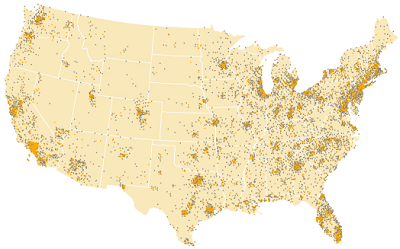
You can also specify multiple fields to show comparisons between the attributes. In the example below, the number of people who own their homes (shown in gray) is compared to the number of people who rent their homes (shown in dark orange.)

Format the legend
You can customize the expression that defines dot density symbology by typing specific words for Symbol and Unit.
The default Symbol word is Dot, but it can be anything descriptive of the symbol you chose, such as Square, Star, or Cow. The Unit option can be left blank if the symbol class label makes it obvious, or you can explicitly state the things being represented, for example, Students, Cows, or Barrels of oil.
Together, these words form the legend expression that appears in the Contents pane and on a legend placed in a layout, for example 1 Square = 100 Barrels of oil. Be aware that the number shown in the Preview may differ from what is actually shown in the legend if Auto adjust dot value to maintain density is checked.
Data exclusion and masking
On the Advanced symbology options tab  , you can do the following:
- Exclude data values from the symbology scheme and optionally define an alternate symbol for excluded values by expanding Data exclusion to define the query.
- Mask the features from specific areas (or constrain them to specific areas) by expanding Masking and choosing a value for Control layer to constrain the dots. For example, you may set water bodies as a control layer when making a dot density map of population to avoid placing population dots in lakes and rivers.